
In order to be able to use the corrgram package, I had to manually install TSP, registry, and dendextend. I’m not sure why that is, but if anyone has issues running corrgram(), take careful not of the errors in the console. So this style of graph is exactly what i was imagining for my data for my final project. My thought was to have a split matrix to show multiple visualizations.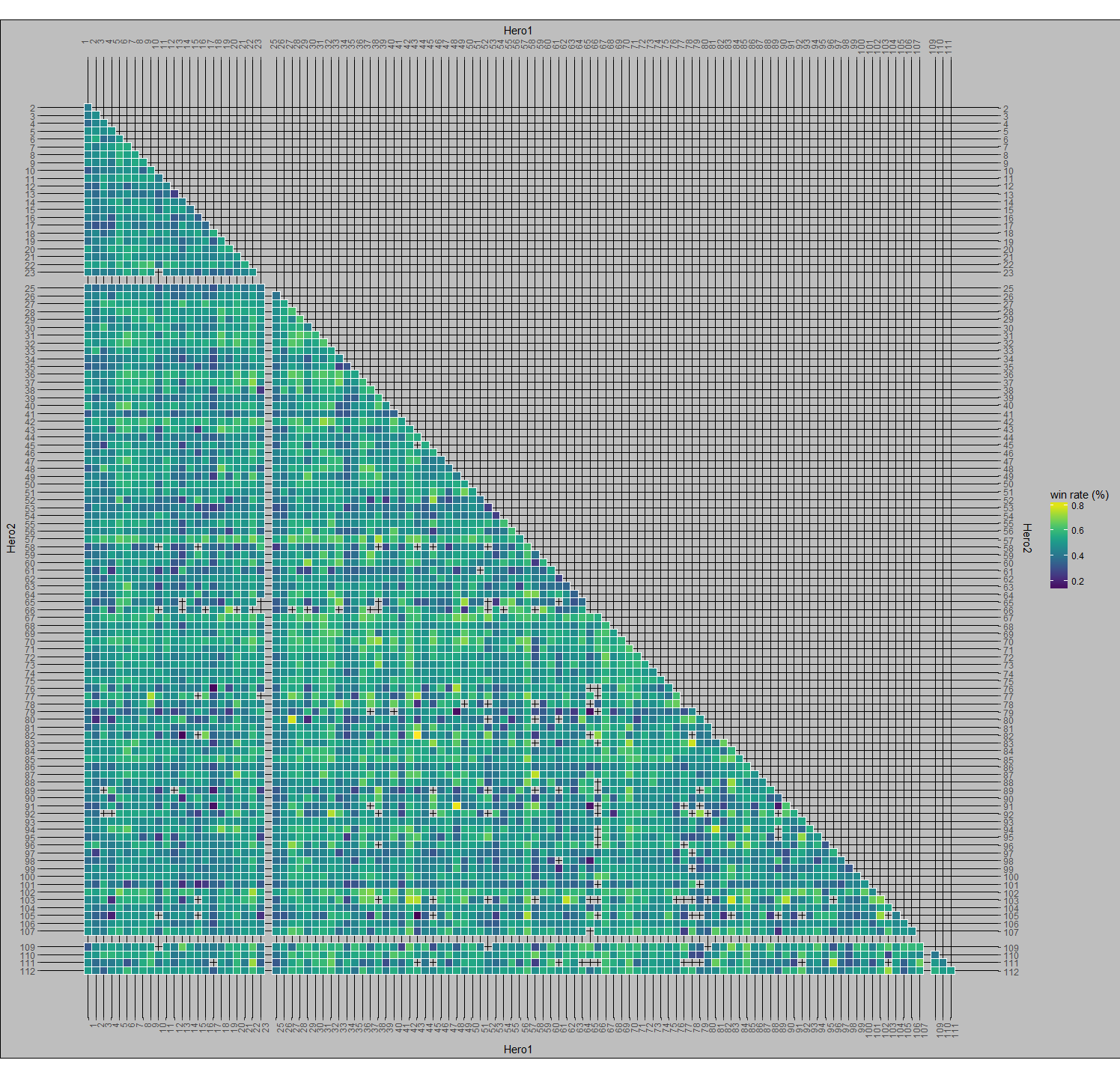
As you can see from this massive image, there only half of the box is used. I’d like to render another set of visualizations in the other half.
This brings us to correlograms. corrgram() makes it easy to generate a split visualization for multiple variables. The graph below was produced simply with this:
corrgram(mtcars, order=TRUE, lower.panel=panel.shade,
 upper.panel=panel.pts, text.panel=panel.txt,
 main="Car Milage Data in PC2/PC1 Order")

Using that same code, but with my data instead of mtcars, you get the chart that you see below (I even left the header). The first thing to notice about the corrplots is that it compares the variables to each other, whereas my big chart plots the value of one attribute (win_percentage) and uses other attributes as the x and y axis (Hero1 & Hero2).
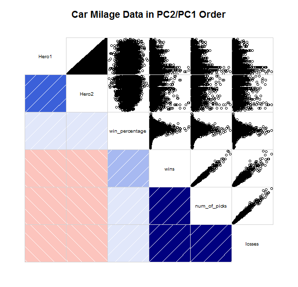
The Hmisc and corrplot packages may have something more for me to be able to utilize, but it looks like I will need to reshape my data as Hmisc seems to only use matrices.