
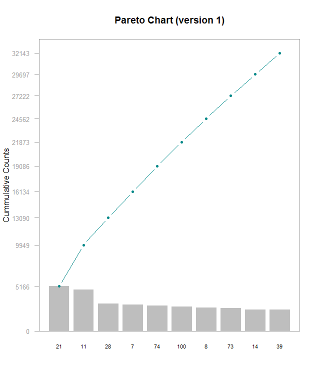
Here’s a Pareto chart (made with this guide) I made with a subset of data from this Kaggle, which I’m using for another project. I’m working on understanding lookup tables to be able to label the x axis with actual names instead of hero_ids, but that’s for another time. This chart is kind of hard to read and shows that the frequencies for these top 10 most frequently picked heroes are generally very close. In order do get the exact values for each bar, you have to do some math with the cumulative counts. I think it’d be better with cumulative percentages labeled on the right side Y- axis, regular counts on the left side, and have the chart be rescaled so that the line chart isn’t so visually dominating. Alternately making the chart wider would help a little. Furthermore, the header needs to be fixed to be relevant to the data. The RStudio guide was good starting point, but it definitely could use some refinements