by Ryan | Jan 20, 2017 | visual analytics
Here is my first visualization using plot.ly. I had also wanted to add a pie chart below each user’s name to show what percentage of their total followers came from Facebook and Twitter, but I’m not sure if plot.ly allows that. Importing the data was mostly easy, except I had issues with headers in xlsx files not being imported as headers. I solved this by just using a csv version of my the data.
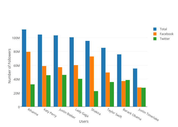
I created the the Total variable as an aggregate of the Facebook and Twitter values in order to help give re-express the comparison between each user. The data is sorted by the highest number of Total followers, which makes it easier to read. The Y axis is scaled linearly so that the differences are clear and unambiguous. Each value is color coded which highlights each grouping and makes it easier to follow values across users. Additionally, each axis is labeled/annotated and the legend reflects the color codes of each value.
by Ryan | Jan 16, 2017 | visual analytics
I quite enjoy infographics and I often see creative visual implementations regularly. Social media outlets I follow to see visualizations are the subreddits r/dataisbeautiful, r/infographics, and r/dataisugly. Dataisugly is a great contrast to the other two and shows a ton of great (in the bad way) examples of how bad data visualization can be. I also look at hockeyviz.com regularly, which does a fantastic job at showing advanced visualizations, for example their relationships between player pairings and success. Another website that I follow is spaghettimodels.com, which shows visualizations for a huge variety of weather data. Actual applications that I have experience with are R and Excel. Others that I haven’t much of or any experience with, but I am aware of, are plot.ly, Gapminder, Tableau, and SAS.
For R, I like how “in charge” of your visualizations you are. Excel can, many times, quickly generate a plot or chart, but many times you aren’t able to make some specific changes to the visualization. Plot.ly is nice because of its accessibility, but I don’t know much about its capability. Gapminder looks great from Hans Rosling’s TED Talks, which are some of my favorite TED Talks, but I don’t know anything about it in the terms of applicability, usability, or capability.