Fire Coop?

Fire Coop: A Peek at the Prevalance of Regime Change Discussions on r/tampabaylightning

Gist available on my Github

First, we’ll start by installing Mike Kearney’s rreddit package. It’s kinda still in development, I guess, but it gets the job done. Some functions from it were either not found or broken, but that may be because I was too lazy to update my version of R from 3.5.0. If you have problems, just throw “mkearney %broken function%” into the ol’ Google and you’ll be good to go. Below, I have included fixed/usable functions that should fulfill everything needed by the rreddit package.

#remotes::install_github("mkearney/rreddit")
#remotes::install_github("mkearney/tbltools")
library(rreddit)
library(tidyverse)
library(tbltools)
library(lubridate)
library(hexbin)

as_tbl <- function(x, ..., validate = FALSE) {
    tibble::as_tibble(x, ..., validate = FALSE)
}

get_comment_reddit <- function(subreddit = "all", author = NULL, n = 1000, after = NULL) {
  n <- ceiling(n / 1000)
  x <- vector("list", n)
  for (i in seq_along(x)) {
    url <- "https://api.pushshift.io/reddit/search/comment/?size=1000"
    if (!identical(subreddit, "all")) {
      url <- paste0(url, "&subreddit=", subreddit)
    }
    if (!is.null(author)) {
      url <- paste0(url, "&author=", author)
    }
    if (!is.null(after)) {
      url <- paste0(url, "&before=", as.numeric(after))
    }
    r <- httr::GET(url)
    j <- httr::content(r, as = "text", encoding = "UTF-8")
    j <- jsonlite::fromJSON(j)
    x[[i]] <- as_tbl(non_recs(j$data))
    if (!"created_utc" %in% names(x[[i]])) break
    x[[i]] <- formate_createds(x[[i]])
    after <- x[[i]]$created_utc[nrow(x[[i]])]
    if (length(after) == 0) break
    #tfse::print_complete(
    #  "#", i, ": collected ", nrow(x[[i]]), " posts"
    #)
  }
  tryCatch(docall_rbind(x),
           error = function(e) x)
}

get_r_reddit <- function(subreddit = "all", n = 1000, after = NULL) {
  n <- ceiling(n / 1000)
  x <- vector("list", n)
  for (i in seq_along(x)) {
    url <- "https://api.pushshift.io/reddit/search/submission/?size=1000"
    if (!identical(subreddit, "all")) {
      url <- paste0(url, "&subreddit=", subreddit)
    }
    if (!is.null(after)) {
      url <- paste0(url, "&before=", as.numeric(after))
    }
    r <- httr::GET(url)
    j <- httr::content(r, as = "text", encoding = "UTF-8")
    j <- jsonlite::fromJSON(j)
    x[[i]] <- as_tbl(non_recs(j$data))
    if (!"created_utc" %in% names(x[[i]])) break
    x[[i]] <- formate_createds(x[[i]])
    after <- x[[i]]$created_utc[nrow(x[[i]])]
    if (length(after) == 0) break
    # tfse::print_complete(
    #   "#", i, ": collected ", nrow(x[[i]]), " posts"
    # )
  }
  tryCatch(docall_rbind(x),
    error = function(e) x)
}

non_recs <- function(x) {
  x[!sapply(x, is.recursive)]
}

formate_createds <- function(d) {
  if ("created" %in% names(d)) {
    d$created <- as.POSIXct(d$created, origin = "1970-01-01")
  }
  if ("created_utc" %in% names(d)) {
    d$created_utc <- as.POSIXct(d$created_utc, origin = "1970-01-01", tz = "UTC")
  }
  d
}

docall_rbind <- function(...) {
  dfs <- list(...)
  if (length(dfs) == 1L && is.list(dfs[[1]]) &&
      is.data.frame(dfs[[1]][[1]])) {
    dfs <- dfs[[1]]
  }
  nms <- unlist(lapply(dfs, names))
  nms <- table(nms)
  max_n <- max(nms, na.rm = TRUE)
  nms <- names(nms)[nms == max_n]
  dfs <- lapply(dfs, function(.x) .x[nms])
  dfs <- do.call("rbind", dfs, quote = TRUE)
  dfs <- dfs[!duplicated(dfs$id), ]
  dfs
}

Through some trial and error, I discovered that there’s 335,116 comments on r/tampabaylightning which date as far back as May 5th, 2010, which brings me to the first interesting point. It’s fairly common knowledge that Jon Cooper is the most tenured coach in the NHL, but it’s interesting that he’s been the coach for 2/3rds of the subreddit’s exisitence. It’s probably safe to say that Cooper is the only head coach that many of the the subreddit’s users may have seen in action.

Anyways, we’ll do a pull of all of the existing comments with the following… Actually, lets get the posts, too, while we’re at it (Trial and Error tells me that there were 27106 posts):

c <- get_comment_reddit("tampabaylightning", n = 335112)
d <- get_r_reddit("tampabaylightning", n = 27106)
# c <- get_comment_reddit("tampabaylightning", n = 5000)
# d <- get_r_reddit("tampabaylightning", n = 3000)

That took a few minutes, but the job got done. Let’s have a look at the general distribution of comments and posts over time.

ggplot() + geom_density(data = c, aes(x = created_utc, color = 'Comments')) + geom_density(data = d, aes(created_utc, color = 'Posts')) + geom_vline(aes(xintercept = as.POSIXct('2013-03-25'), color = 'Cooper Hired')) + 
  scale_x_datetime(breaks = c(as.POSIXct('2010-01-01'), as.POSIXct('2020-01-01')), date_breaks = '1 year', date_labels = "%Y")

Those peaks clearly mark the playoffs and really show the activity drop during the failure-to-launch of the 16-17 season, but the early-exit of the 18-19 season is masked by the activity behind the wildly-successful regular season.

e <- c %>% filter(str_detect(tolower(body), 'fire coop'))
f <- d %>% filter(str_detect(tolower(title), 'fire coop'))
c <- c %>% mutate(fc_y = case_when(str_detect(tolower(body), 'fire coop') == T ~ 1,
                                   TRUE ~ 0),
                  date = as.Date(created_utc, 'EST'),
                  year = year(date))

There is apparently only 266 comments and 15 posts that include the string “fire coop”, which I find crazy because it seems like every post-game thread has been absolutely spammed with that statement for the last year.

c %>% filter(date >= as.Date('2015-01-01')) %>% group_by(date) %>% summarize( perc_fc = sum(fc_y)/ n()) %>% ggplot() + geom_hex(aes(x = date, y = perc_fc)) + scale_x_date( breaks = c(as.Date('2015-01-01'), as.Date('2020-01-01')), date_breaks = '1 year', date_labels = "%Y")

c %>% filter(date >= as.Date('2015-01-01')) %>% group_by(date) %>% summarize( perc_fc = sum(fc_y)/ n()) %>% mutate(year = year(date)) %>% ggplot() + geom_hex(aes(x = date, y = perc_fc)) +  facet_wrap( ~ year, scales= 'free_x') +  theme(axis.text.x = element_text(angle = 90, hjust = 1))

It looks like the calls for canning aren’t just coming from your grandmother during strawberry season, but they’ve also jumped way up even since when we missed the playoffs. Interestingly, it doesn’t look like the calls for firing Cooper have necessarily increased throughout this season. Perhaps we should look to see if there’s a secret “CAN COOP” clubhouse that keep regurgitating the same calls.

e %>% mutate(date = as.Date(created_utc, 'EST'),
             year = year(date)) %>%
group_by(date) %>% count(author) %>% arrange(desc(n)) %>% filter(n>1)

If we figure that, after a bad game, someone might call for firing Cooper in the Post-Game threads and then maybe in another thread, then we only have 2 users that have really gone above-and-beyond in a single day. u/BigSaveBigCat is really the most egregious offender for a single-day spam session, but let’s look at who has been most consistent.

e %>% mutate(date = as.Date(created_utc, 'EST'),
             year = year(date)) %>% count(author) %>% arrange(desc(n)) %>% filter(n>2)

I see u/Boltsfan91 in both of these lists, which brings one point to a head: people quoting other people are getting lumped in with the wrong crowd. For example, here are u/Boltsfan91’s 3 posts:

e %>% filter(author == 'Boltsfan91') %>% select(body)

The posts are pretty long, but the gist is is that they were not calling for the end of Cooper’s tenure. I should probably try some sentiment analysis on these posts to try to weed out the pro-Cooper comments, but it’s the sunday before Christmas and I don’t really feel like looking up that stuff right now.

It looks like there isn’t just a brigade of users that are constantly calling for resignation, nor are they really spamming across multiple threads in a day. I feel like that might makes this discussion even more concerning as the increase in posts is driven by the everyman and not just a few fair-weather fans.

Regardless of sentiment, however, the point still stands that Cooper’s position is a hot topic for discussion. And, while the Lightning aren’t quite at the 2018 Blues’ level of performance, they aren’t doing nearly as well as we’d expected. I’d bet that most people are willing to agree that we have all the pieces to be successful, but the question is whether or not we have the directions to get to the cup. Additionally, I don’t think anyone would be surprised if Cooper got fired. It seems like everyone has been calling every game “important” now, but he game against the Panthers on 12/23 seems like it will be a particularly-important game for the Bolts. The Cats currently teetering between Playoff and Wildcard for the playoffs and, even though we are a game behind them, we’re still 4 points away from taking the playoff slot and a loss to them will put us that much further behind.

Visual Analytics Final Project: Dota 2 Hero Analysis

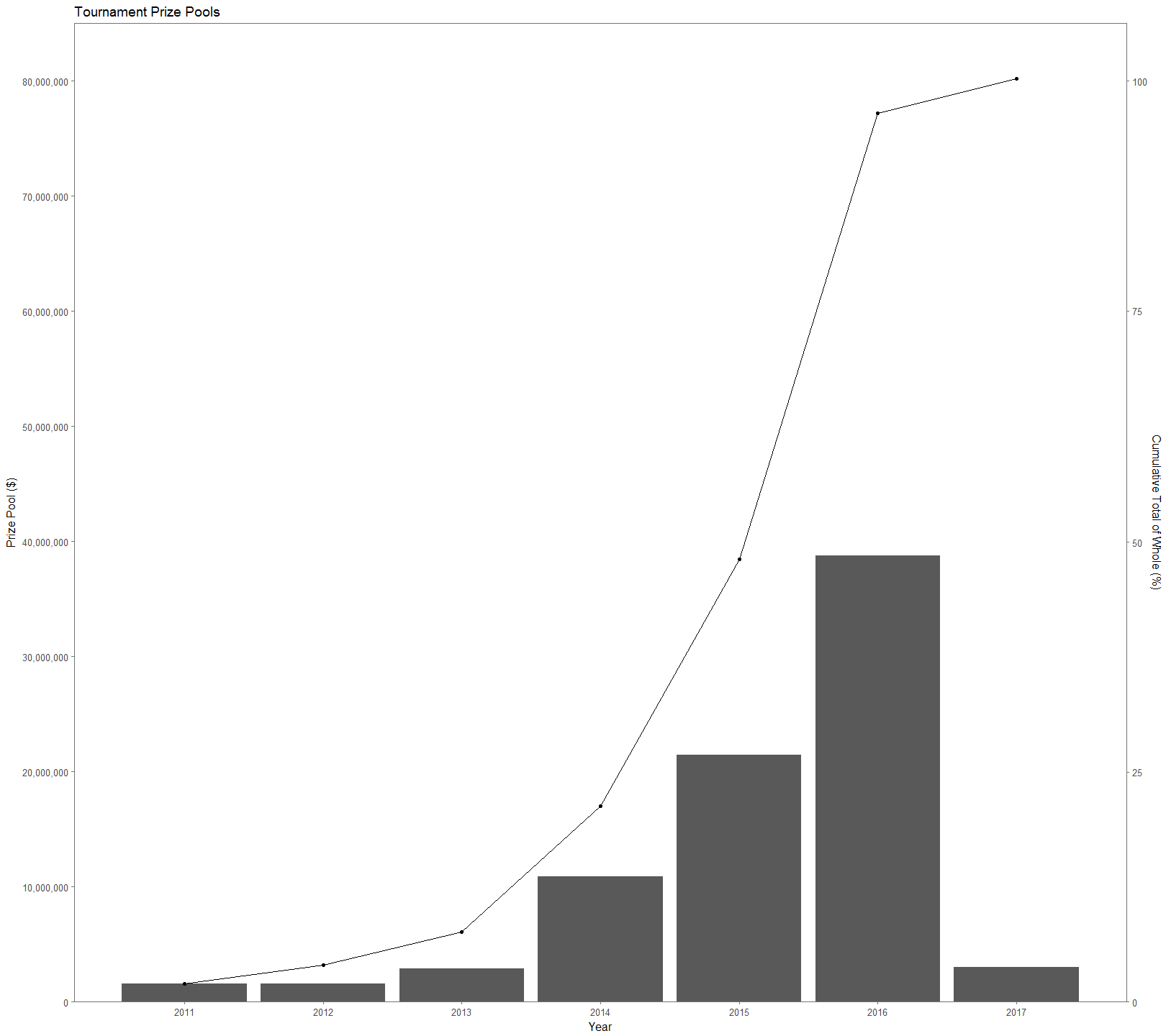
Dota 2 is a popular multiplayer online game developed by Valve that pits two teams of five players each.  Each player picks one character, or hero, (two players can’t play the same character, regardless of team) from a pool of 110+ characters with the goal of destroying the opposing team’s base.  Since 2011 tournaments hosted by Valve have totaled over $80 million in prize pools (Figure 1), making far-and-above the most lucrative e-sports title.  The prize pools of tournaments have exploded over time, attracting new players.  However, being a new player in any game is difficult, let alone one with a learning curve as steep as Dota 2.  The sheer number of heroes in the game, combined with how unique each one is, makes for there to be synergies and combinations that are more successful than others. This causes it is extremely difficult for even professional players to navigate the hero picking process leading to a victory.  Using this kaggle dataset on Dota 2 matches provided by opendota.com, a stat tracking website for Dota 2 players, I explore hero picks to gain insight into individual hero success, the success of hero combinations, and hero utility.

Figure 1.

We can start off talking about the data so that we have some additional context for the numbers.  The data set is a parse of 50,000 games, which is roughly the number of games played in an hour.  The entire set is a 434 mb compilation of 18 spreadsheets of different information.  I used mainly players.csv, match.csv, and hero_names.csv, which total to 89 attributes.  To get the data into a useful form for this project, I had to stitch together several of the provided spreadsheets and clean up values.  I was able to toss out 35 games that were missing data and 7,745 games that involved players leaving the game.  A player leaving significantly alters the course of the game and it wouldn’t be proper to include those in this analysis.  This leaves 42,220 games that include information about 211,100 hero picks and win rates.

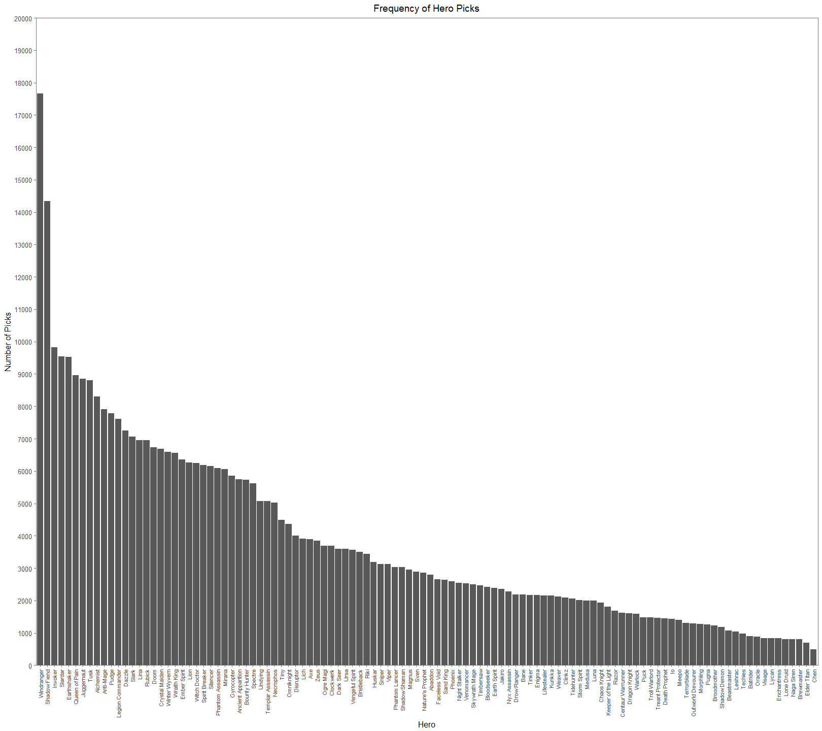
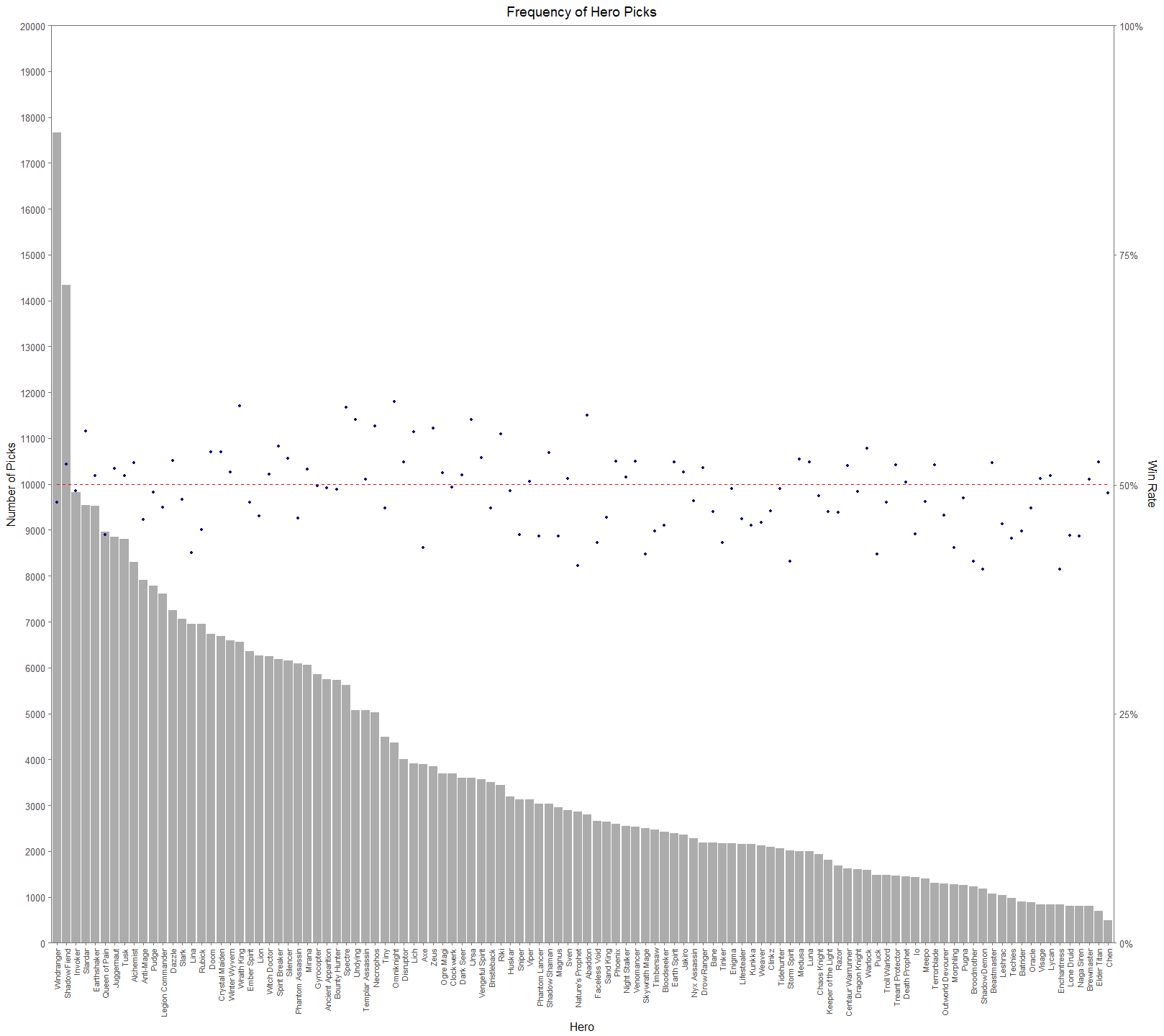
From Figure 2. (I suggest looking at the full resolutions of these visualizations), we can see that there is a significant difference in picks across the cast of heroes.  The general tendency for people would think that successful heroes are picked more often.  It’s easy to jump to the conclusion that Windranger and Shadow Fiend must have very high win rates and that Chen and Elder Titan have very low win rates. This would be a hasty and erroneous conclusion.  In Figure 3, we add a secondary axis to show each hero’s win rate, a dotted red line to show the 50% mark, and lower the alpha of the bars to make the points easier to see.

Figure 2.


Figure 3.


Figure 3 makes it much easier to see how assumptions about the relationship between pick rate and win rate aren’t straight forward.  In the top 12 most picked heroes, there is an even 6-6 split between being in the top or bottom half of win rate.  On the other hand, for 12 least picked heroes, 8 have win rates less than 50%.  Later on we’ll see that this isn’t even a great measure of hero performance.  Dota 2 is first and foremost a team game.  An individual hero’s performance isn’t a good measure because we need to see and understand how heroes interact with each other.  If you’re starting a pickup game of basketball and have a whole bunch of people to pick from, you don’t want to pick 5 people that primarily want to play point.  You need to form a balanced team of people that play well together and compliment each other.  The same concept is true for Dota 2.

Figure 4.


To try to uncover hero synergies and hero utility, or how well a hero plays with others, I generated all unique permutations of 2 hero pairs for each team and made a set of visualizations that pair the heroes together.  For example, a 3 person team of ABC would lead to the following permutations: AB, AC, BC.  Why focus on hero pairs?  Team based games are generally the most fun when you play with friends.  The goal with looking at hero pairs is to establish a form for a player to determine how to pick a hero that is likely to be successful with a friend who has picked a hero.  Figure 4 aims to really bring out common pairings by comparing them against the median pick rate (for reference, the median pick rate for hero pairs was 78).  Note: The empty spaces are hero id’s that were not used at the time of the data collection.  For example, Earthshaker and Shadowfiend are paired together roughly 20 times more than the median pick rate.  The color scale lets us see streaks of common pick rates.  If you look at Windranger’s X and Y axes, you’ll see that they’re significantly lighter than the other squares.  This is a reflection of just how much higher her pick rate is compared to other heroes.  If we use the same graph type and chart win rates rather than pick rates, then we can see how successful hero pairs are together.

Figure 5


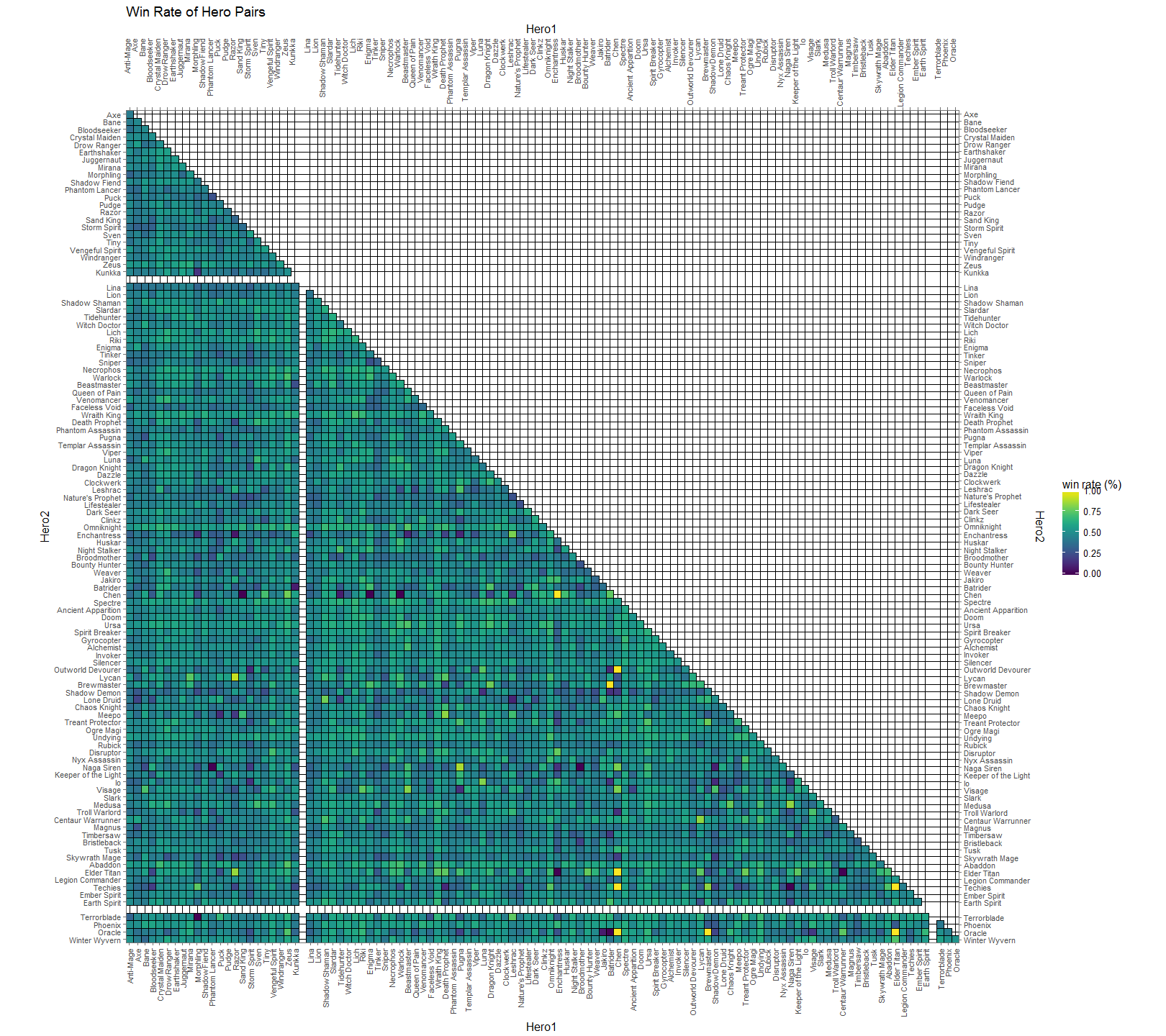
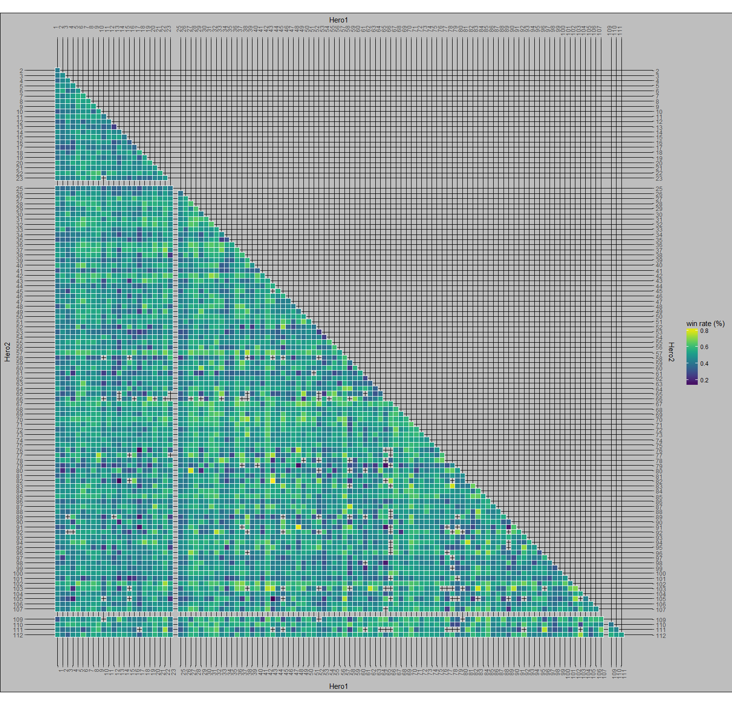
Here, in Figure 5, we chart the win rate of hero pairs.  Successful pairs are more yellow and unsuccessful pairs are more blue.  You’ll see some black speckles around (ex. Jakiro & Oracle, Omniknight & Elder Titan, Chen & Sandking | Warlock | Enigma).  These are all heroes that were played together a single time in the data set.  At the time this data was collected, there were 110 playable heroes.  This means that there are 5,995 unique 2-pair combinations of those heroes (the formula for unique 2-pair permutations is n(n-1)/2). It’s pretty notable that some of these combinations weren’t picked at all, when you consider that a single game will have 20 unique hero pairs. Similar to the black spots, the bright yellow spots are of particular interest.  If you remember from earlier, Chen had a very low overall pick rate and his axes for the pick per median are practically dark, but here he has 5 bright yellow spots to indicate a fantastic win rate.  This is because I didn’t discriminate these tables by numbers of picks.  This leads Chen has a 100% win rate with Outworld Devourer, Enchantress, Oracle, Elder Titan, and Techies although all of these pairing combined only amount to 16 co-occurrences.

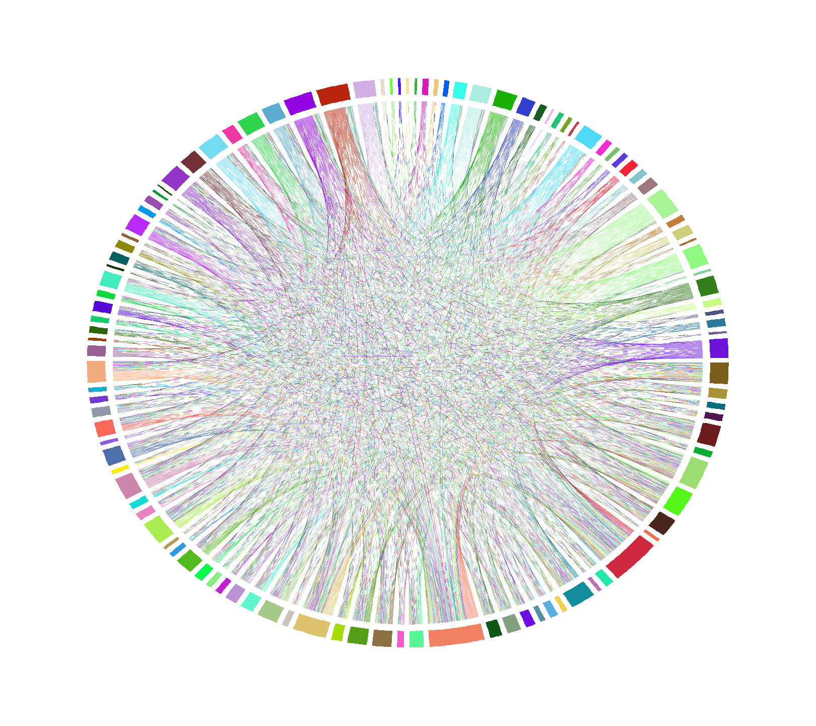
Another way to visualize hero pairs is by chord diagram.  Figure 6 is an unlabeled chord diagram showing every hero pair from the data set.  Now, this particular diagram isn’t useful due to the sheer number of hero pairs available, but if we start setting rules for it, patterns will start to emerge.

Figure 6.  A chord diagram of all Hero pairs.


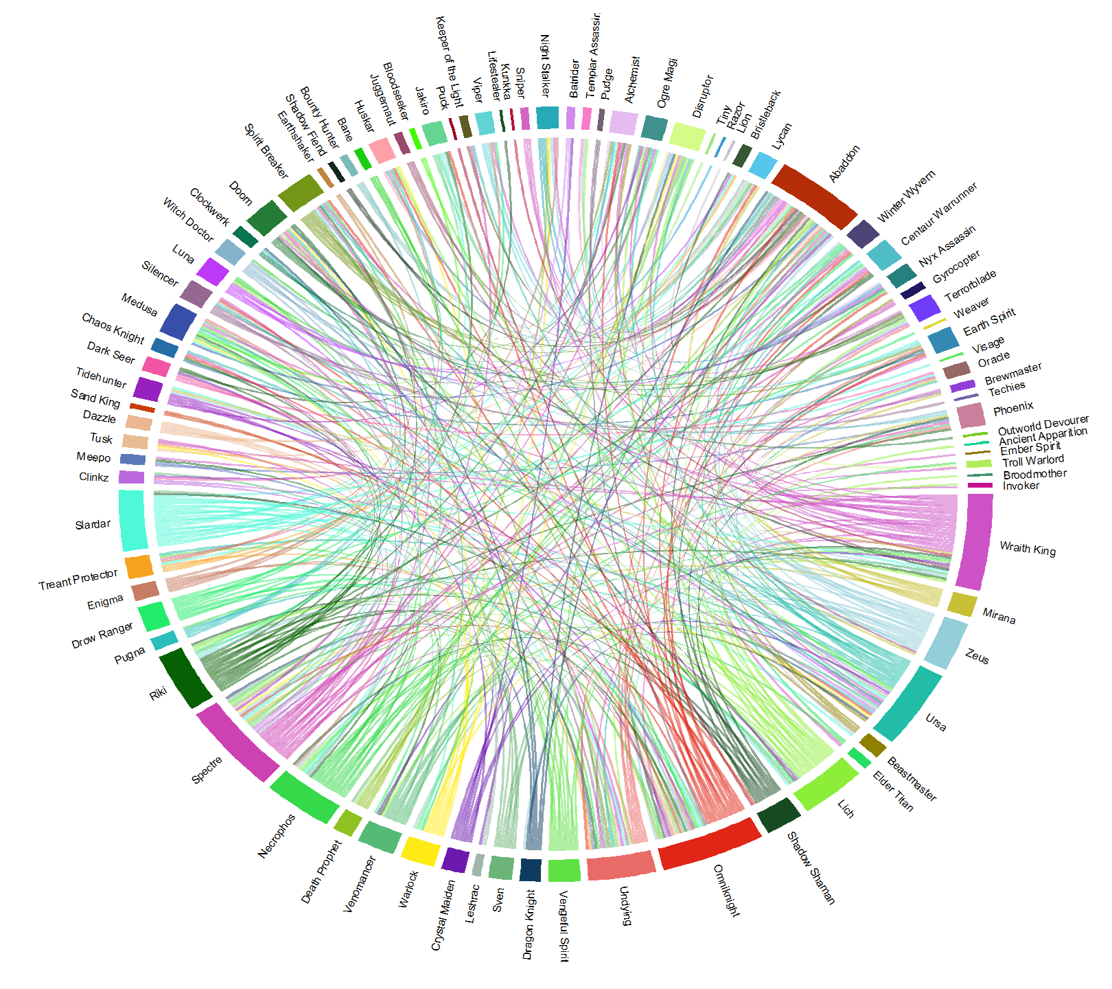
I started off by only allowing pairs that were at least as frequent as the first quartile (37 games) of overall pick frequency, and then picking pairs that had a minimum of a 60% win rate to get Figure 7.  For reference, these combinations represent the top 6% winningest combinations of recorded hero pairs.  This figure still mostly looks like a bowl of rainbow spaghetti, but we’re at least able to trace some of links.  Additionally, the size of each hero’s arc shows us how many other heroes they pair up with at 60% win rate or higher.  Omniknight, Abaddon, Wraith King, Ursa, and Spectre all have a lot of links, implying that they have more utility with successful pairs and can be fit into more team combinations than heroes with smaller slices, like Visage. An interesting thing to note here is that Shadow Fiend (near the 11 o’clock position), the second most popular hero, has a tiny sliver and has just 2 other heroes with whom he shares a 60+% win rate with.  Additionally Windranger, the most popular hero, isn’t even represented in this grouping.

Figure 7.  Chord diagram of 60+% win rate hero pairs

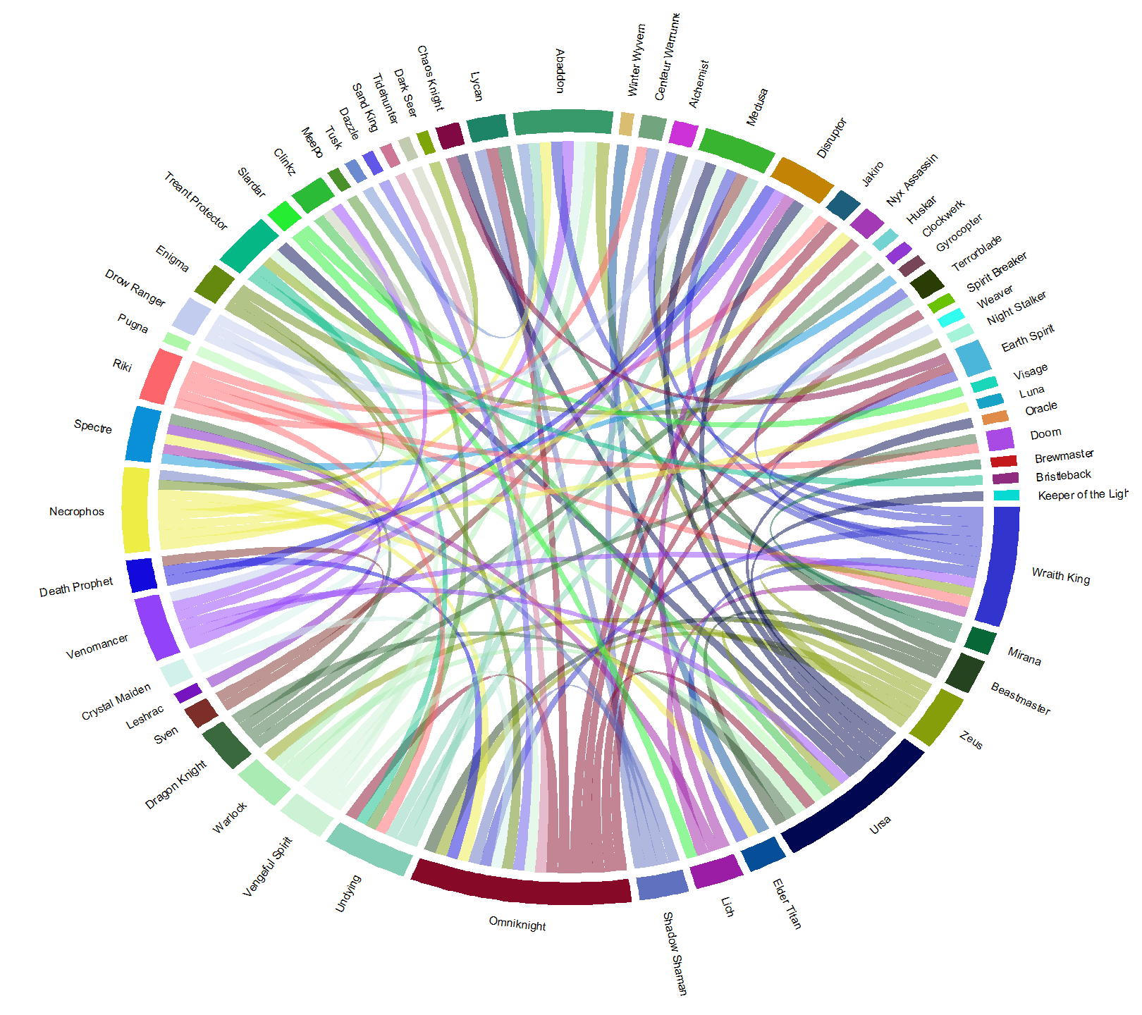
If we narrow the selection of hero pairs down even further, to win rates 65% and higher, we get Figure 8.  This is top 2% winningest combinations for hero pairs.  Here, the dominance of Omniknight, Ursa, and Wraith King grow while Abaddon stays about the same and Specter becomes less common.  The heroes here have displayed are significantly represented in picks, and win a lot with their links.  The heroes with more links win a lot with more different teams.  Coincidentally, the heroes here with the biggest arc lengths are also, generally, easy to play.  This makes them great choices for beginners.  If you’re already knowledgeable about Dota 2 heroes, then you can use the diagram to draw conclusions about why these pairs work well together.  For example, Lich is paired with Wraith King, Disruptor, Spectre, and Slardar.  Lich synergizes very well with all of these heroes due to his abilities being able to slow and stun, either covering some of his partner’s weaknesses or pairing with their abilities to get more bang for your buck.

Figure 8.  Chord diagram of 65+% win rate hero pairs. Top 2% of hero-pair win rates.


It’s important to adjust for hero success when looking for these links.  If you were to go through the same method for Figure 8, but instead of looking at win rate, you look at just hero pick frequency, then you get Figure 9.  Windranger and Shadow Fiend reappear, representing nearly 1/3rd of the pairs.  The mean win rate of Figure 9 is pretty much a coin toss, weighing in at just 50.5%.  For comparison, the mean win rate for the pairs in Figure 8 is 67.5%.

Figure 9. Chord Diagram of top 2% of pick frequency.


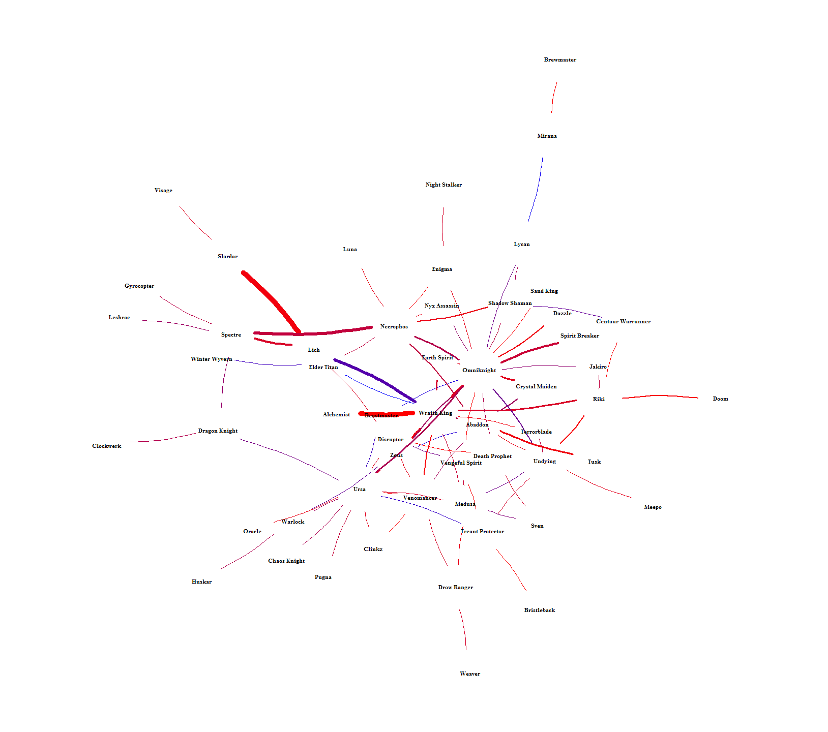
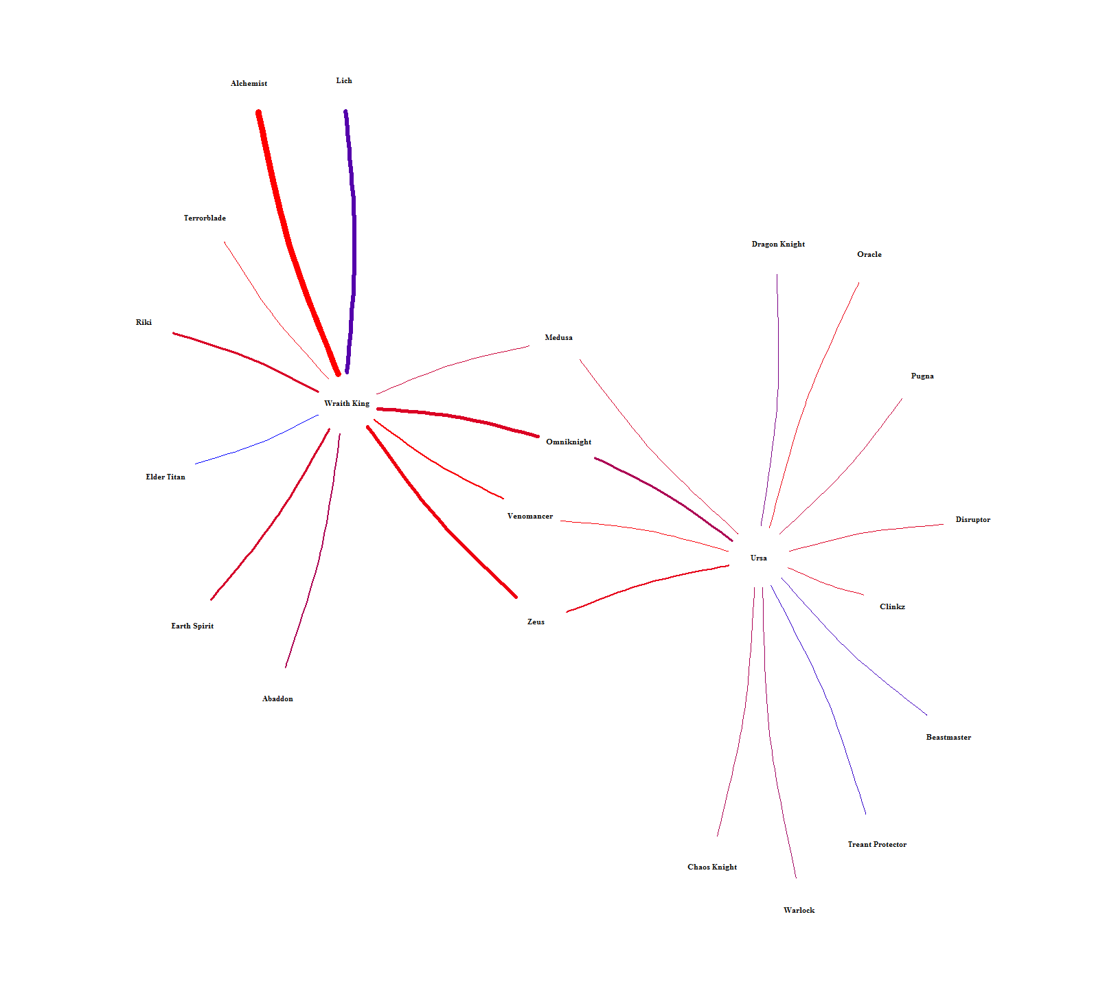
The chord graph makes it difficult to see how hero-pairs are related to each other.  Figure 10 solves this by showing the intra-pairing relationships by laying out each hero into a network.  The color is scaled between lower (red) and higher (blue) win rates and the width of each connection is scaled by how many times each pair was picked.  Heroes can then be related to each other by seeing who they have in common or how far removed they are from everyone else.  For example, Brewmaster is way out on the fringe, only connected to one person (Mirana) who is also only connected to one person (Lycan).  An example of indirect similarity is Ursa and Wraith King.  They don’t have any direct connection, but they share connections to each other through Medusa, Omniknight, Venomancer, and Zeus.  It’s hard to see in Figure 10, so I singled them out in Figure 11.  Relationships like this should mean that each indirect hero-link alludes to the heroes having similar roles.


Figure 10. Network of hero pairs with 65+% win rate.


Figure 11.  Relationship between Wraith King and Ursa from Figure 10.

Through this project, I’ve created a framework to explore and assess the relationships and success between heroes with visualizations.  In these visualizations, I’ve explored time series analysis, part to whole and ranking analysis, correlation analysis, multivariate analysis, and a couple different types of network analysis.  For future work, I’m also working with this data to try to use machine learning techniques to establish predictions for victory depending on hero pairs.

The code I used can be seen at my github.


Other voices about visual analytics

I think that Alan Smith and David McCandless both had significant impacts on how I view data visualization.  In Smith’s TEDx talk he shows how numeracy skills are surprisingly lacking, how bad we are at perceiving statistics about society, and about how he used strategies to represent numbers through icons rather than presenting fractions and percentages.  McCandless’s TED talk shows how relatively simple charts, with context of other data, can uncover interesting insights.  I think that both of these talks hint that visualization creation should take the audience into consideration.  Smith wanted to create an engaging tool to show us how our perceptions about our areas compare to actual facts about it, but was aware of how bad many people are at basic math skills and adjusted accordingly.  McCandless talks about how bad we are at putting big numbers in context and adjusts his examples by making comparisons and normalizing data.  As always, context is key.  This is true for both extracting meaning data as well as determining the skills and literacy of your prospective readers.

Tufte vs Few and complexity for modern users

Ultimately, it has seemed to me that Tufte’s principles revolve around an overarching format that aims for visualizations to stand as their own, independent, sources of information.  While talking about his principle of the integration of evidence he says, “words, numbers, pictures, diagrams, graphics, charts, tables belong together” and explains that all of these tools are to be integrated to make a comprehensive visualization.  This pairs with his last principle, content counts most of all, in that the medium for the answer for his proposed question “What are the content-reasoning tasks that this display is supposed to help with?” are these information rich visualizations.

I think this is different from Few’s principles as Few, so far, has aimed at simplicity and readability.  For example, Chapter 4 of Now You See It is focused almost entirely on simplicity and readability.  Things like Sorting, Scaling, and aggregating ensure that visualizations are presented to us in ways that are logical, intuitive, and easy to interpret.  Tufte says, “Perhaps the numbers or data points may stand alone for a while, so we can get a clean look at the data, although techniques of layering and separation may simultaneously allow a clean look as well as bringing other information into the scene”.  To Tuft, you may temporarily use some data in an isolated way, but he then goes on to say that you can probably just use some layering techniques to be able to view that data in the context of everything else.  I love beautiful representations of complex data, and the examples that Tufte presents in Beautiful Evidence are stunning, but I can’t help but feel that it is just better to isolate some data sometimes.  Tufte’s theme is great and is sure to produce some fantastic visualizations, but I feel like parts of his principles are good for creating visualizations for the visual analytics crowd and not necessarily for creating quick, easy to grok, visualizations for everyday users.

This graph is a good example of what I’m talking about as it’s the champion of Tufte’s chapter “The Fundamental Principles of Analytical Design”.  A lot of my classes so far have all talked about the lack of rigor or willful ignorance displayed by end users of information.  People generally won’t read emails, they won’t read beyond abstracts of papers, they won’t follow instructions if they’re too long, the PEBCAK issue in IT, etc.  These apparently general tendencies of humans makes me question how much effort we can expect end users to put into understanding a visualization.  Can we expect them to read a paragraph explaining how the graph works before even looking at the data to understand the information encoded in it?  How many won’t notice that these troop flows are transposed over the topography of western Russia?  What other information will be lost in translation?

Correlation in R

In order to be able to use the corrgram package, I had to manually install TSP, registry, and dendextend.  I’m not sure why that is, but if anyone has issues running corrgram(), take careful not of the errors in the console.  So this style of graph is exactly what i was imagining for my data for my final project.  My thought was to have a split matrix to show multiple visualizations.

As you can see from this massive image, there only half of the box is used.  I’d like to render another set of visualizations in the other half.

This brings us to correlograms.  corrgram() makes it easy to generate a split visualization for multiple variables.  The graph below was produced simply with this:

corrgram(mtcars, order=TRUE, lower.panel=panel.shade,
 upper.panel=panel.pts, text.panel=panel.txt,
 main="Car Milage Data in PC2/PC1 Order")

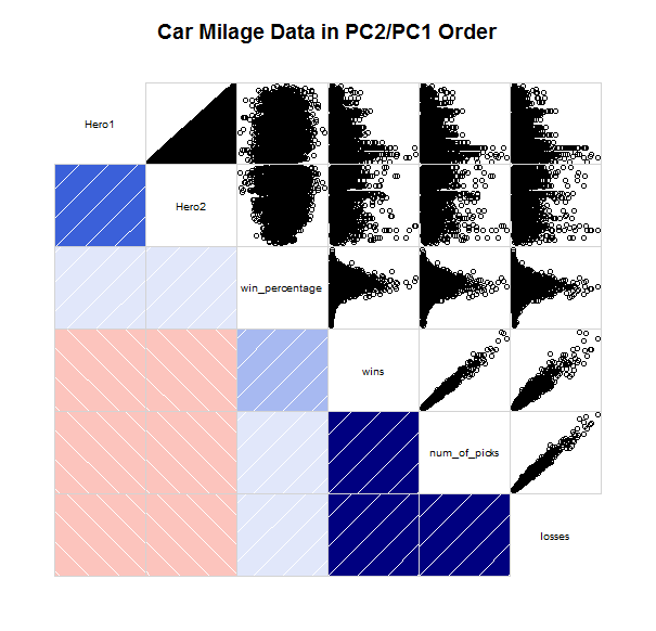
Using that same code, but with my data instead of mtcars, you get the chart that you see below (I even left the header).  The first thing to notice about the corrplots is that it compares the variables to each other, whereas my big chart plots the value of one attribute (win_percentage) and uses other attributes as the x and y axis (Hero1 & Hero2).

The Hmisc and corrplot packages may have something more for me to be able to utilize, but it looks like I will need to reshape my data as Hmisc seems to only use matrices.