by Ryan | Dec 2, 2016 | advanced statistics
I have a set of 359,043 tweets (object named zq) with 27 variables from 8/25 -9/5 that have the word “zika” in them. After removing any tweets that have duplicate tweet_id’s and tweets that are scraped/parsed incorrectly, I was left with 358,613 tweets. I would like to determine how different hash tags effect how often a tweet with an image gets retweeted.
From looking at the data previously, I noticed that bees were a hot topic and not something we normally think about within the context of zika. I suspect that, within the data set, using bees as a hashtag will be associated a higher amount of retweets per tweet than some other tweets. I’m going to compare #bees with #zika and #mosquito.
H0: # of retweets per tweet ( bees = zika = mosquito )
H1: # of retweets per tweet ( bees > zika | mosquito )
To start off, we need to isolate the tweets that have embedded images. I have determined that the easiest and most accurate way to identify an embedded image is to look for “photo/1” in the parsed_media_url field of the data set:
zqimage <- zq[grep("photo/1", zq$parsed_media_url),]
This leaves us with 83,266 tweets that have images embedded in them. Now, the hashtags are stuck within the “hashes” column, and are delimited by semicolons. Using tidyr, we can separate those out into more columns:
library("tidyr")
zq1 <- separate(zqimage, col = hashes, into = c("hash1", "hash2", "hash3",
 "hash4", "hash5", "hash6", "hash7", "hash8", "hash9", "hash10", "hash11",
 "hash12", "hash13", "hash14", "hash15", "hash16", "hash17", "hash18", "hash19",
 "hash20"), sep = ";", extra = "merge", fill = "right")
This adds 19 more columns, which should then either have their own hashtag, or a N/A value. From here, we can use apply to count up the frequency of each hashtag and create a table to show us what the 30 most popular hashtags are:
library("plyr")
hashes <- apply(zq1[,24:43], 2, FUN=function(x) plyr::count(x))
hashes <- do.call(rbind.data.frame, hashes)
hashes <- plyr::ddply(hashes,"x",numcolwise(sum))
hashes <- hashes[!is.na(hashes[,1]),]
hashes <- head(arrange(hashes,desc(freq)), n = 100)

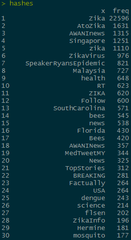
The hashtags I want to compare are “bees” and “mosquito” which are the 14th and 30th most common hashtags, respectively. In order to do further analysis, I need to subset the rows to only include the max value of retweet_count for each unique tweet. I’m going to do it to zqimage instead of the hashes object so that I can use grep on the non separated hashes column later:
library("dplyr")
zqimage <- zq[grep("photo/1", zq$parsed_media_url),]
zqimage <- zqimage %>% group_by(text) %>% filter(retweet_count == max(retweet_count),
 favorite_count == max(favorite_count))
zqimage <- arrange(zqimage, desc(retweet_count))
I want to compare the contributions between hash tags, so I can get rid of any rows that don’t have any hashtags
zqimage <- zqimage[!is.na(zqimage$hashes), ]
This leaves us with 9,651 unique tweets that have hashtags and have embedded images. In order to conduct an ANOVA test we need to categorize the tweets. In order to do so, we need to create a new column that says if the tweets have “bees”, “mosquito”, or “zika” in them
zqimage$hashhash <- ifelse(grepl("bees", zqimage$hashes, ignore.case = TRUE), "bees",
 ifelse(grepl("mosquito", zqimage$hashes, ignore.case = TRUE), "mosquito",
 ifelse(grepl("zika", zqimage$hashes, ignore.case = TRUE), "zika", "Other")))
From here, we can apply the ANOVA test
fit <- aov(zqimage$retweet_count ~ hashhash, data = zqimage)
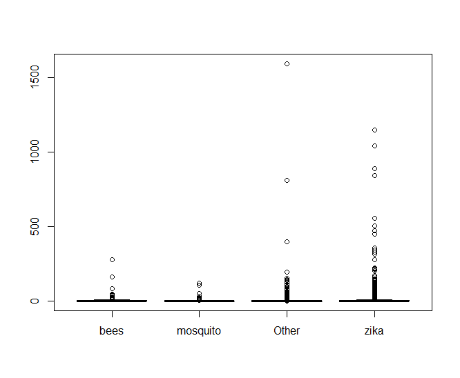
Making a boxplot of the data shows something very telling
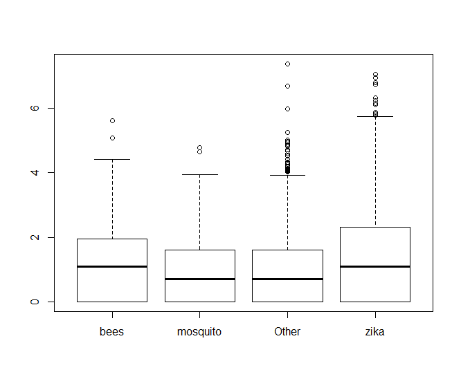
It looks like there’s an oppressive amount of tweets with abnormally high values of retweets that are making it hard to see what’s going on, so lets look at a log scale of only the tweets that have been retweeted.
zqn0 <- zqimage[!zqimage$retweet_count == 0,]
boxplot(log(zqn0$retweet_count) ~ zqn0$hashhash

From there, we can see clearly that hashtags with bees performs better than mosquito, but it looks almost neck-and-neck with zika. If we look at the values of fit$coefficients, we can see that bees edges out zika in performance too.
> fit$coefficients
 (Intercept) hashhashmosquito hashhashOther hashhashzika
  7.1780822        -4.9327290    -4.8003600   -0.9336632

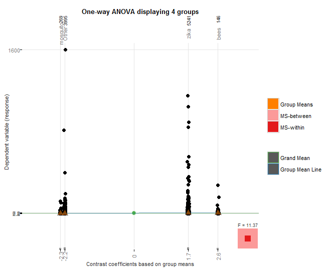
I used the granovagg package to create the above graphic which again shows that bees outperforms mosquito, even though mosquito had nearly an order of magnitude fewer hashtags than case-insensitive “bees”, and it also outperforms case-insensitive “zika” despite the fact that zika hashtags had over 22,000 more hashtags.

The p value for the hashes is very small, causing us to fail to reject the null hypothesis and accept the alternate hypothesis that the bees hashtags perform better than the mosquito or zika hash tags.
by Ryan | Nov 7, 2016 | advanced statistics
Null hypothesis: The proportion of people who choose the same hotel again will be the same for beach combers and windsurfers.
To start off, I constructed my data.frame in a very roundabout manner:
>Beachcomber <- c(163,64,227)
>Windsurfer <- c(154,108,262)
>Choose_again <- c("Yes", "No", "Total")
>dat <- data.frame(Choose_again, Beachcomber, Windsurfer)
>dat$Total <- dat$Beachcomber + dat$Windsurfer
>dat <- dat[,-1]
>rownames(dat) <- c("Yes", "no","total")

>dat

      Beachcomber Windsurfer Total
Yes           163        154   317
no             64        108   172
total         227        262   489
Next, I run the chi-test and save it in an object:
>res<-chisq.test(dat[1:2,1:2])
> res

Pearson's Chi-squared test with Yates' continuity correction

data: dat[1:2, 1:2]
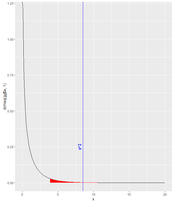
X-squared = 8.4903, df = 1, p-value = 0.0035
I was stuck on that for a while, trying to figure out exactly which parts of the data.frame needed to be included/excluded. I did notice that this way of doing it didn’t give me the error that other combinations did though. I assume it’s because the function implemented Yates’ continuity correction, which is automatically implemented for 2×2 tables. The p-value is quite small, so at a threshold of p=.05, the null hypothesis would be rejected and we’d say that it appears that the proportion of people who choose to return to their hotel is different for each group.

gg <- data.frame(x = seq(0,20,.1))
gg$y <- dchisq(gg$x, 1)
ggplot(gg) +
 geom_path(aes(x,y)) +
 geom_ribbon(data=gg[gg$x>qchisq(.05,1,lower.tail=FALSE),], aes(x,ymin=0, ymax=y), fill="red")+
 geom_vline(xintercept = res$statistic, color = "blue")+
 labs( x = "x", y = "dchisq(gg$x, 1)")+
 geom_text(aes(x=8, label="x^2", y=0.25), colour="blue", angle=90)
by Ryan | Oct 31, 2016 | advanced statistics
> high <- c(10,9,8,9,10,8))
> moderate <- c(8,10,6,7,8,8)
> low <- c(4,6,6,4,2,2)
> reaction <- c(10,9,8,9,10,8,8,10,6,7,8,8,4,6,6,4,2,2)
> stresslvls <- c(rep("high",6), rep("moderate",6), rep("low",6))
> dat <- data.frame(reaction,stresslvls)
> analysis <- lm(reaction ~ as.factor(stresslvls), data = dat)
> anova(analysis)
Analysis of Variance Table

Response: stress
                      Df Sum Sq Mean Sq  F value     Pr(>F)
as.factor(stresslvls)  2 82.111  41.056   21.358  4.082e-05 ***
Residuals             15 28.833   1.922
---
Signif. codes: 0 ‘***’ 0.001 ‘**’ 0.01 ‘*’ 0.05 ‘.’ 0.1 ‘ ’ 1
The ANOVA test essentially breaks a sample down into smaller groups and compares the variance between the means of each of those groups to determine how much variance can be attributed to chance.
Here, we have analyzed a grouping of the reaction times of participants that were subjected to various levels of stress. Above, we can see the return of the ANOVA test. We can see that the between-group mean sum of squares is 41.056. This shows that the difference between each of the individual sample means and the mean of all the samples. The F value is the ratio between the mean squares of the mean squares. The larger the F statistic is, the more you can rule out the difference between the means being due to chance. The fact that the P value is so small allows us to reject the null hypothesis and claim that the level of stress the participants are subjected does have an effect on their reaction times.
by Ryan | Oct 16, 2016 | advanced statistics
1a. H0: A cookie will break at more than 70 pounds of force or greater; u >= 70
Ha: A cookie will break at less than 70 pounds of force on average; u < 70
1b. yes
1c. p = 0.0359 There’s a 3.59% chance of finding a sample mean of 69.1 if u >=70.
1d. p = 0.0002 since p < 0.5, there is enough evidence to dismiss H0
1e. p = 0.0227 since p < 0.5, there is enough evidence to dismiss H0
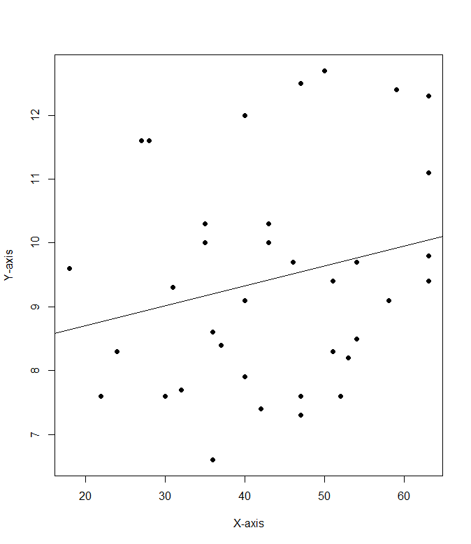
2a. cor(mod8$Cost.per.serving, mod8$Fibber.per.serving)
2b. .228
2c: 
by Ryan | Oct 9, 2016 | advanced statistics
Q1. I created a function to do the calculations to find mu for the Confidence Interval:
ci <- function(xbar, con, sig, n)
{
con1 = con + ((1-con)/2)
mu = xbar + (qnorm(con1) * (sig / sqrt(n)))
sn = xbar – (qnorm(con1) * (sig / sqrt(n)))
paste(“The confidence interval is between “, sn, ” and “, +mu, ” and the estimated mean is “, xbar, sep =””)
}
The confidence intervals came in as follows:
> ci(115, .9, 15, 100)
[1] “The confidence interval is between 112.532719559573 and 117.467280440427 and the estimated mean is 115”
> ci(115, .95, 15, 100)
[1] “The confidence interval is between 112.06005402319 and 117.93994597681 and the estimated mean is 115”
> ci(115, .98, 15, 100)
[1] “The confidence interval is between 111.510478188939 and 118.489521811061 and the estimated mean is 115”
Q2
[1] “The confidence interval is between 83.0400360154599 and 86.9599639845401 and the estimated mean is 85”
Q3
((1.96 * 15) / 5)^2
[1] 34.5744
I think the minimum sample size should be 35 if I’m thinking of the zscore tails properly.
edit: After reviewing the last question, 35 is right, but how i got to it was wrong
III
The biggest thing to note about this is the difference between the 95% confidence interval and the 97.5th percentile ranking. Each tail of the 95% confidence interval contains 2.5% of the area under the curve. But we’re only looking for a single tailed value, so we must use qnorm(.975).
I feel like I was perhaps a little bit confused about what questions 1 and 2 were asking for, or what the answer should look like.
