Tufte vs Few and complexity for modern users
Ultimately, it has seemed to me that Tufte’s principles revolve around an overarching format that aims for visualizations to stand as their own, independent, sources of information. While talking about his principle of the integration of evidence he says, “words, numbers, pictures, diagrams, graphics, charts, tables belong together” and explains that all of these tools are to be integrated to make a comprehensive visualization. This pairs with his last principle, content counts most of all, in that the medium for the answer for his proposed question “What are the content-reasoning tasks that this display is supposed to help with?” are these information rich visualizations.
I think this is different from Few’s principles as Few, so far, has aimed at simplicity and readability. For example, Chapter 4 of Now You See It is focused almost entirely on simplicity and readability. Things like Sorting, Scaling, and aggregating ensure that visualizations are presented to us in ways that are logical, intuitive, and easy to interpret. Tufte says, “Perhaps the numbers or data points may stand alone for a while, so we can get a clean look at the data, although techniques of layering and separation may simultaneously allow a clean look as well as bringing other information into the scene”. To Tuft, you may temporarily use some data in an isolated way, but he then goes on to say that you can probably just use some layering techniques to be able to view that data in the context of everything else. I love beautiful representations of complex data, and the examples that Tufte presents in Beautiful Evidence are stunning, but I can’t help but feel that it is just better to isolate some data sometimes. Tufte’s theme is great and is sure to produce some fantastic visualizations, but I feel like parts of his principles are good for creating visualizations for the visual analytics crowd and not necessarily for creating quick, easy to grok, visualizations for everyday users.

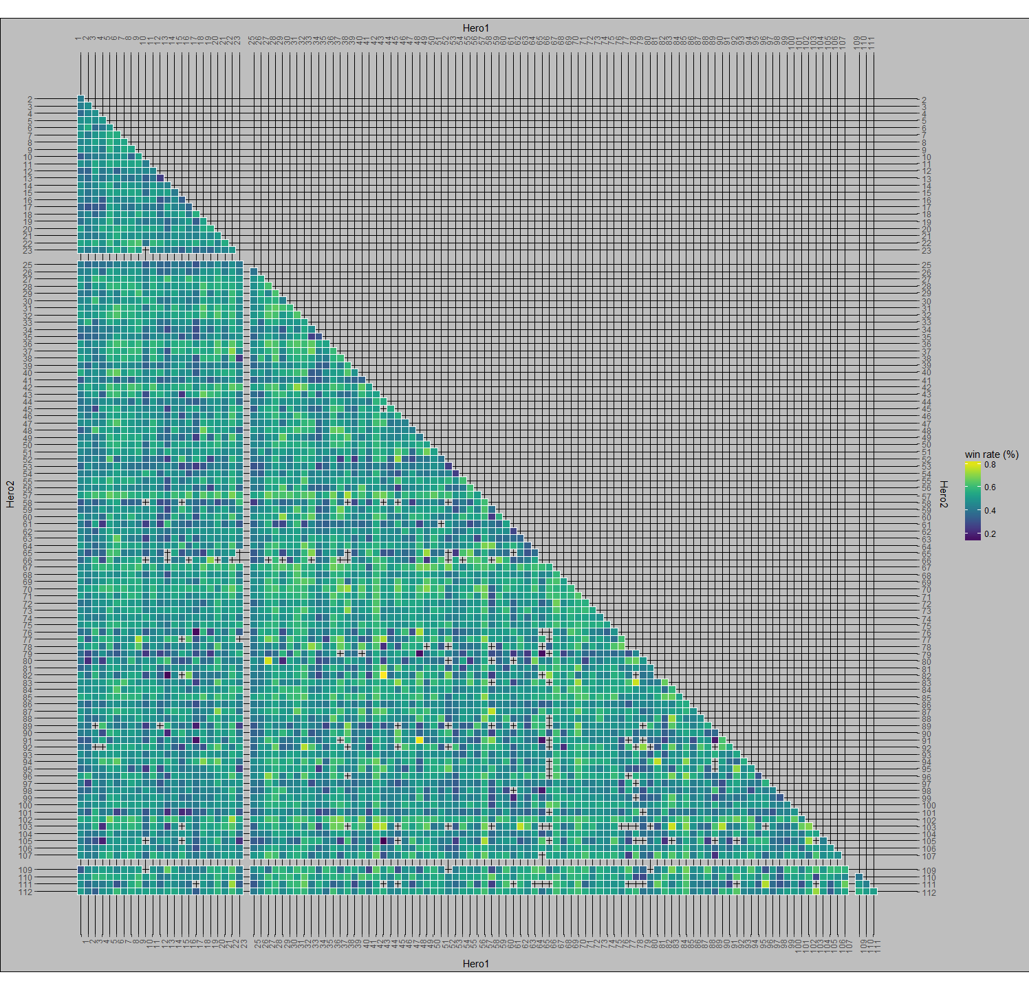
This graph is a good example of what I’m talking about as it’s the champion of Tufte’s chapter “The Fundamental Principles of Analytical Design”. A lot of my classes so far have all talked about the lack of rigor or willful ignorance displayed by end users of information. People generally won’t read emails, they won’t read beyond abstracts of papers, they won’t follow instructions if they’re too long, the PEBCAK issue in IT, etc. These apparently general tendencies of humans makes me question how much effort we can expect end users to put into understanding a visualization. Can we expect them to read a paragraph explaining how the graph works before even looking at the data to understand the information encoded in it? How many won’t notice that these troop flows are transposed over the topography of western Russia? What other information will be lost in translation?