by Ryan | Feb 26, 2017 | visual analytics

Here is a scatter plot by @KenSteif on twitter that shows the distribution of the price of LEGO sets. On top of the graph, Ken has super imposed a regression line to show the trend of the cost. From the graph you can see that the data is ungrouped and that there are a few outliers in the top left and far right areas. However, the scatterplot is generally homoscedastic.
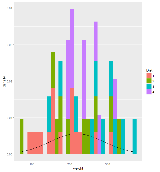
ggplot(df, aes(x=weight, fill = Diet)) + geom_histogram(aes(y = ..density..)) + stat_function(fun=dnorm, args=list(mean=mean(df$weight), sd=sd(df$weight)))
I tried to make a histogram out of the ChickWeight dataset by looking at the weights on the final day and coloring them by their diet. However, adding the normal curve didn’t go well. I wanted the graph to display the counts and have the normal curve scaled to an appropriate Y value, but I didn’t make any significant progress. Most of the responses I saw on how to do this reset the Y axis to density, then plot the density curve. It really bugs me that I didn’t have a quick or easy solution to this given my experience with R. Ggplot2 is a system that I am aware I need to work on, and am actively trying to work on.
by Ryan | Feb 13, 2017 | visual analytics
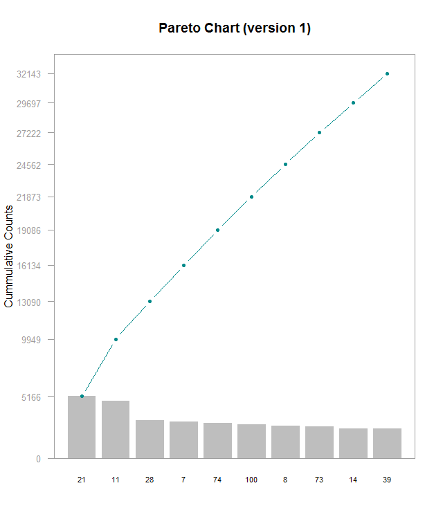
Here’s a Pareto chart (made with this guide) I made with a subset of data from this Kaggle, which I’m using for another project. I’m working on understanding lookup tables to be able to label the x axis with actual names instead of hero_ids, but that’s for another time. This chart is kind of hard to read and shows that the frequencies for these top 10 most frequently picked heroes are generally very close. In order do get the exact values for each bar, you have to do some math with the cumulative counts. I think it’d be better with cumulative percentages labeled on the right side Y- axis, regular counts on the left side, and have the chart be rescaled so that the line chart isn’t so visually dominating. Alternately making the chart wider would help a little. Furthermore, the header needs to be fixed to be relevant to the data. The RStudio guide was good starting point, but it definitely could use some refinements
by Ryan | Feb 5, 2017 | visual analytics
Here is a time-series graph I made of some data I collected from automated, neural network runs of Super Mario World. Plot.ly makes this super easy by allowing you to quickly select the axes and add new variables. Here, I will be discussing some of Stephen Few’s best practices for time-series analysis and how they apply to this graph:
- Aggregating to Various Time Intervals
I’ve chosen to display this data with the time interval being each “generation” of the neural net. Increasing the time resolution to each species and genome creates a huge amount of noise in the data, in which trends get lost. Going by each generation makes it much, much easier to see progression.
- Viewing Time Periods in Context
Including the data from the start to the finish of each level allows us to see the entire progression of each generation of the neural network. It’s easy to narrow down the time scale to make it look like there has been no progress made. Plot.ly makes this very easy zoom into smaller time periods, but also allows easy access to the full context of the graph.
- Optimizing a Graph’s Aspect Ratio
The problem here might be how I have my website set up (I’m working on a redesign), but this graph is very cramped. Viewing it on Plot.ly’s site its much more comfortable. Yoshi’s Island 4 was completed relatively quickly, but it’s hard to see on my site due to its location.
- Stacking Line Graphs to Compare Multiple Variables
I’ve combined several levels of data to see how progression and the number of generations to completion vary. Stacking the line graphs makes it much easier to read than having a set of individual graphs, though organizing it can create other readability troubles.
- Expressing Time as 0-100% to Compare Asynchronous Process
I did not utilize this in my graph but I think it would be interesting to see. Doing so could possibly uncover some level design patterns. The Super Mario games are known for being designed in a way that introduces specific level mechanics early on, generally in a safe way, then ramps up the implementation of it. I suspect that this would be evident when viewing the levels in a manner of percentage of completion.