
The source for my data is: https://vincentarelbundock.github.io/Rdatasets/csv/lme4/sleepstudy.csv
Plot()
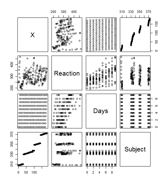
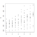
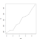
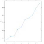
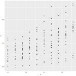
>plot(sleepstudy) yielded this lovely menagerie of graphs. it looks like it took all the variables and compared them to each other variable and made a metagraph. For example, you can look at square 3,3 and see that it compares the number of days going without sleep to the reaction time. Assigning the Days (D) and Reaction (R) to their own objects allows us to do plot(D,R) to get a larger version of that graph. Using the aggregate function, you can calculate the mean of each reaction measurement per day, assign them to objects, and plot them (>plot(MD,R, type=”b”).
Lattice()
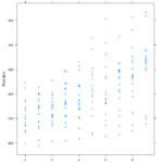
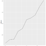
Similar graphs to the plot() graphs can be achieved with Latttice(). A simple >xyplot(Reaction~Days, sleepstudy) will yield the scatterplot below, and >xyplot(R~D, type=”b”) gives the line chart. The lattice graph is much more pleasing to look at. Having the y intervals oriented horizontally, having the intervals for the x and y values on both sides of the graph, and overall spacing give a much nicer look to the graph. Also, it’s utilization of the space in the frame is much better compared to the plot() graph, which looks like it has large, empty reserved space for a graph title.
ggplot2()
Ggplot2() adds a layer of complexity that is the idea of layers themselves. The bare bones “give me a graph quickly” plots from ggplot give graphs that are nicer than plot(). You get grid laid down across your graphs, with horizontal interval markers on the y axis. You also get even better space utilization than the quick-and-dirty lattice() graphs. The downside to the ggplot2() graphs is that the x intervals are less relatable. It defaulted to 2.5 day intervals for this particular graph, which makes analyzing the data significantly more abstract than full day or every-other-day intervals.