Here’s our starting data:
>Frequency_of_Visits<-c(0.6,0.3,0.4,0.4,0.2,0.6,0.3,0.4,0.9,0.2)
> Blood_Pressure<-c(103,87,32,42,59,109,78,205,135,176)
> First_Assessment<-c(1,1,1,1,0,0,0,0,NA,1)
> Second_Assessment<-c(0,0,1,1,0,0,1,1,1,1)
> Final_Decision<-c(0,1,0,1,0,1,0,1,1,1)
The values are the frequency of each patients’ doctor visits, their blood pressure measurements, first assessment (made by a general doctor), a second assessment (made by an external doctor), and a final decision (made by the head of the emergency unit). With all that loaded into the values, we move onto making some box and whisker plots and histograms. The real, unspoken, champ of this exercise is going to be:
par(mfrow=c(1,3))
This command lets us make a matrix with 1 row and 3 columns to which we will put our boxplots.
> boxplot(Blood_Pressure~First_Assessment, names=c(“good”,”bad”))
> boxplot(Blood_Pressure~Second_Assessment, names=c(“low”,”high”))
> boxplot(Blood_Pressure~Final_Decision, names=c(“low”,”high”))
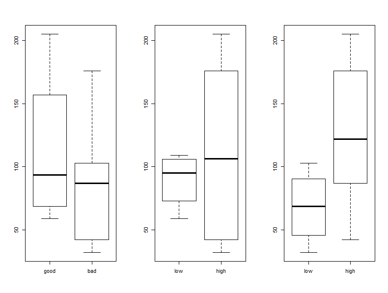
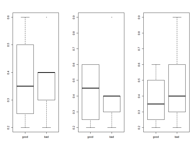
Here, we should note that “good” blood pressure is also “low priority”. The external doctor (plot 2) has a huge range in which they declare blood pressures to be high priority, and the general doctor seems to mostly consider relatively low values of blood pressure to be dangerous. Next up we’re going to compare the frequency of patients’ visits compared with the status of their blood pressure and we’ll see that first two doctors seem to note that people that visit less often are somewhat in more need of care.
> boxplot(Frequency_of_Visits~First_Assessment, names=c(“good”,”bad”))
> boxplot(Frequency_of_Visits~Second_Assessment, names=c(“good”,”bad”))
> boxplot(Frequency_of_Visits~Final_Decision, names=c(“good”,”bad”))
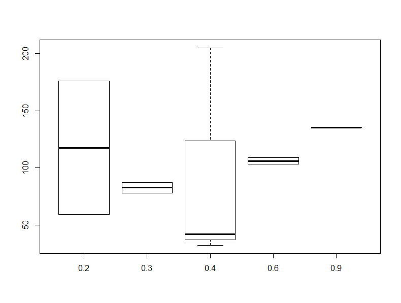
In order to make this next plot I had to reset my to be one row and column with par(mfrow=c(1,1)). This one will compare blood pressure to the frequency of visits and shows that the results are all over the board and that there’s really not that much data to make a good correlation anyways.
> par(mfrow=c(1,1))
> boxplot(Blood_Pressure~Frequency_of_Visits)
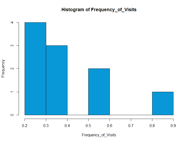
Finally, we make a histogram of the Frequency of visits, which shows that people are more likely to make less frequent visits.
> hist(Frequency_of_Visits, col=”#0898d7″)