Visual Analytics Final Project: Dota 2 Hero Analysis
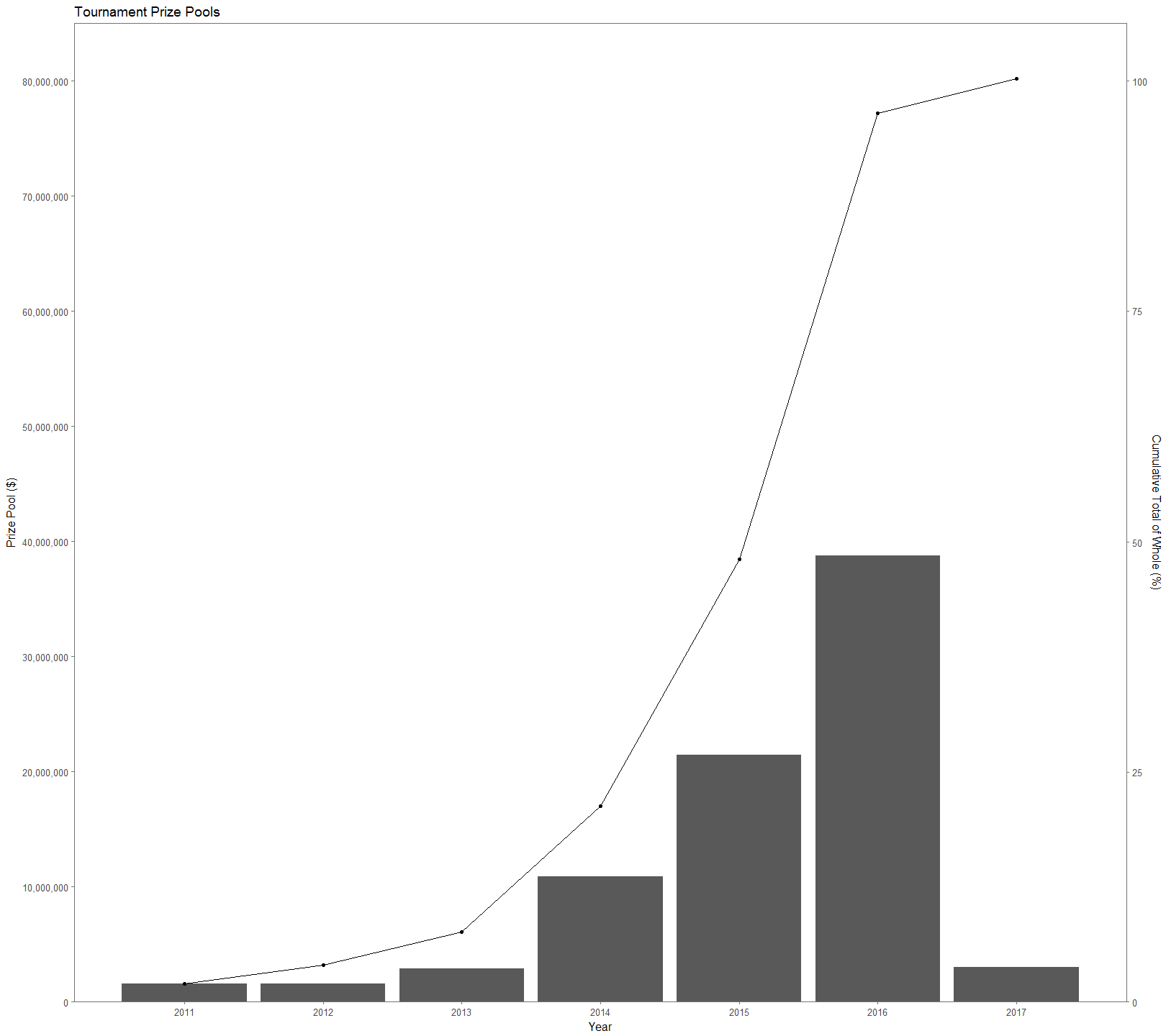
Dota 2 is a popular multiplayer online game developed by Valve that pits two teams of five players each. Each player picks one character, or hero, (two players can’t play the same character, regardless of team) from a pool of 110+ characters with the goal of destroying the opposing team’s base. Since 2011 tournaments hosted by Valve have totaled over $80 million in prize pools (Figure 1), making far-and-above the most lucrative e-sports title. The prize pools of tournaments have exploded over time, attracting new players. However, being a new player in any game is difficult, let alone one with a learning curve as steep as Dota 2. The sheer number of heroes in the game, combined with how unique each one is, makes for there to be synergies and combinations that are more successful than others. This causes it is extremely difficult for even professional players to navigate the hero picking process leading to a victory. Using this kaggle dataset on Dota 2 matches provided by opendota.com, a stat tracking website for Dota 2 players, I explore hero picks to gain insight into individual hero success, the success of hero combinations, and hero utility.
We can start off talking about the data so that we have some additional context for the numbers. The data set is a parse of 50,000 games, which is roughly the number of games played in an hour. The entire set is a 434 mb compilation of 18 spreadsheets of different information. I used mainly players.csv, match.csv, and hero_names.csv, which total to 89 attributes. To get the data into a useful form for this project, I had to stitch together several of the provided spreadsheets and clean up values. I was able to toss out 35 games that were missing data and 7,745 games that involved players leaving the game. A player leaving significantly alters the course of the game and it wouldn’t be proper to include those in this analysis. This leaves 42,220 games that include information about 211,100 hero picks and win rates.
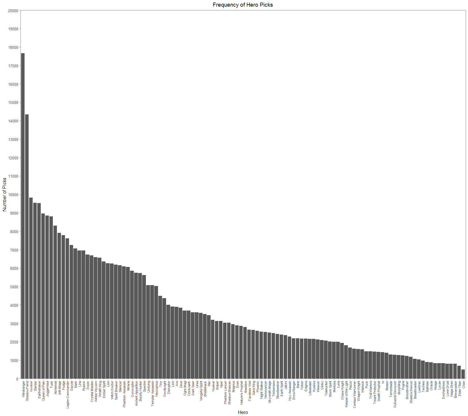
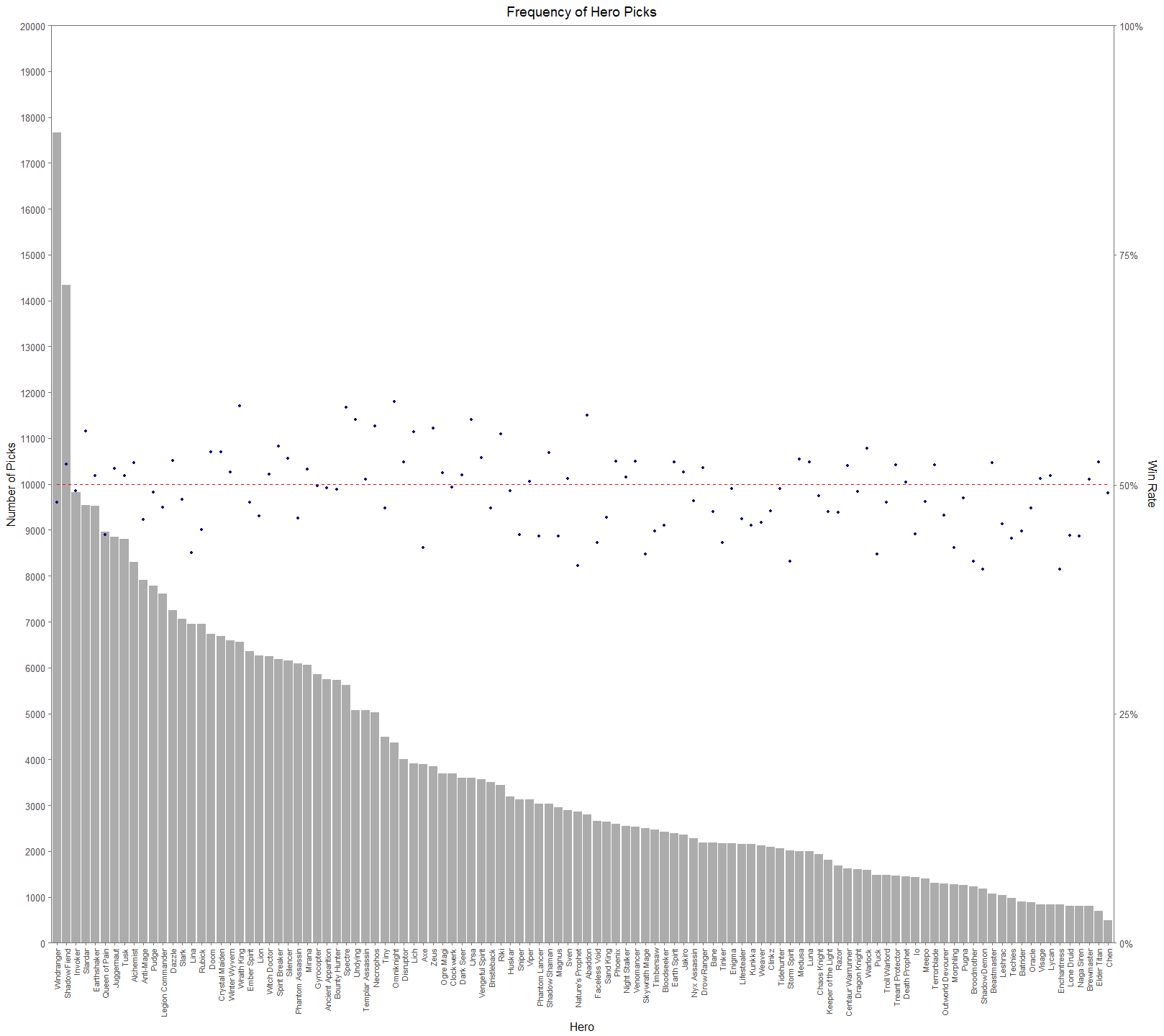
From Figure 2. (I suggest looking at the full resolutions of these visualizations), we can see that there is a significant difference in picks across the cast of heroes. The general tendency for people would think that successful heroes are picked more often. It’s easy to jump to the conclusion that Windranger and Shadow Fiend must have very high win rates and that Chen and Elder Titan have very low win rates. This would be a hasty and erroneous conclusion. In Figure 3, we add a secondary axis to show each hero’s win rate, a dotted red line to show the 50% mark, and lower the alpha of the bars to make the points easier to see.
Figure 3 makes it much easier to see how assumptions about the relationship between pick rate and win rate aren’t straight forward. In the top 12 most picked heroes, there is an even 6-6 split between being in the top or bottom half of win rate. On the other hand, for 12 least picked heroes, 8 have win rates less than 50%. Later on we’ll see that this isn’t even a great measure of hero performance. Dota 2 is first and foremost a team game. An individual hero’s performance isn’t a good measure because we need to see and understand how heroes interact with each other. If you’re starting a pickup game of basketball and have a whole bunch of people to pick from, you don’t want to pick 5 people that primarily want to play point. You need to form a balanced team of people that play well together and compliment each other. The same concept is true for Dota 2.
To try to uncover hero synergies and hero utility, or how well a hero plays with others, I generated all unique permutations of 2 hero pairs for each team and made a set of visualizations that pair the heroes together. For example, a 3 person team of ABC would lead to the following permutations: AB, AC, BC. Why focus on hero pairs? Team based games are generally the most fun when you play with friends. The goal with looking at hero pairs is to establish a form for a player to determine how to pick a hero that is likely to be successful with a friend who has picked a hero. Figure 4 aims to really bring out common pairings by comparing them against the median pick rate (for reference, the median pick rate for hero pairs was 78). Note: The empty spaces are hero id’s that were not used at the time of the data collection. For example, Earthshaker and Shadowfiend are paired together roughly 20 times more than the median pick rate. The color scale lets us see streaks of common pick rates. If you look at Windranger’s X and Y axes, you’ll see that they’re significantly lighter than the other squares. This is a reflection of just how much higher her pick rate is compared to other heroes. If we use the same graph type and chart win rates rather than pick rates, then we can see how successful hero pairs are together.
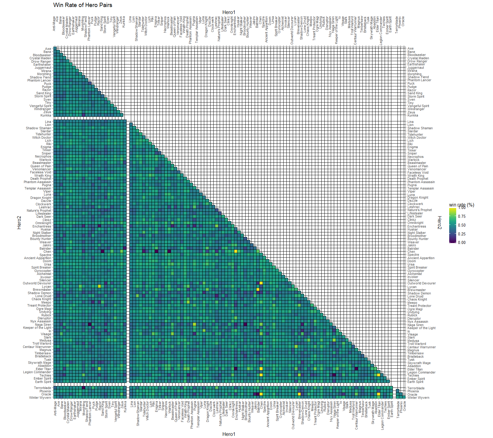
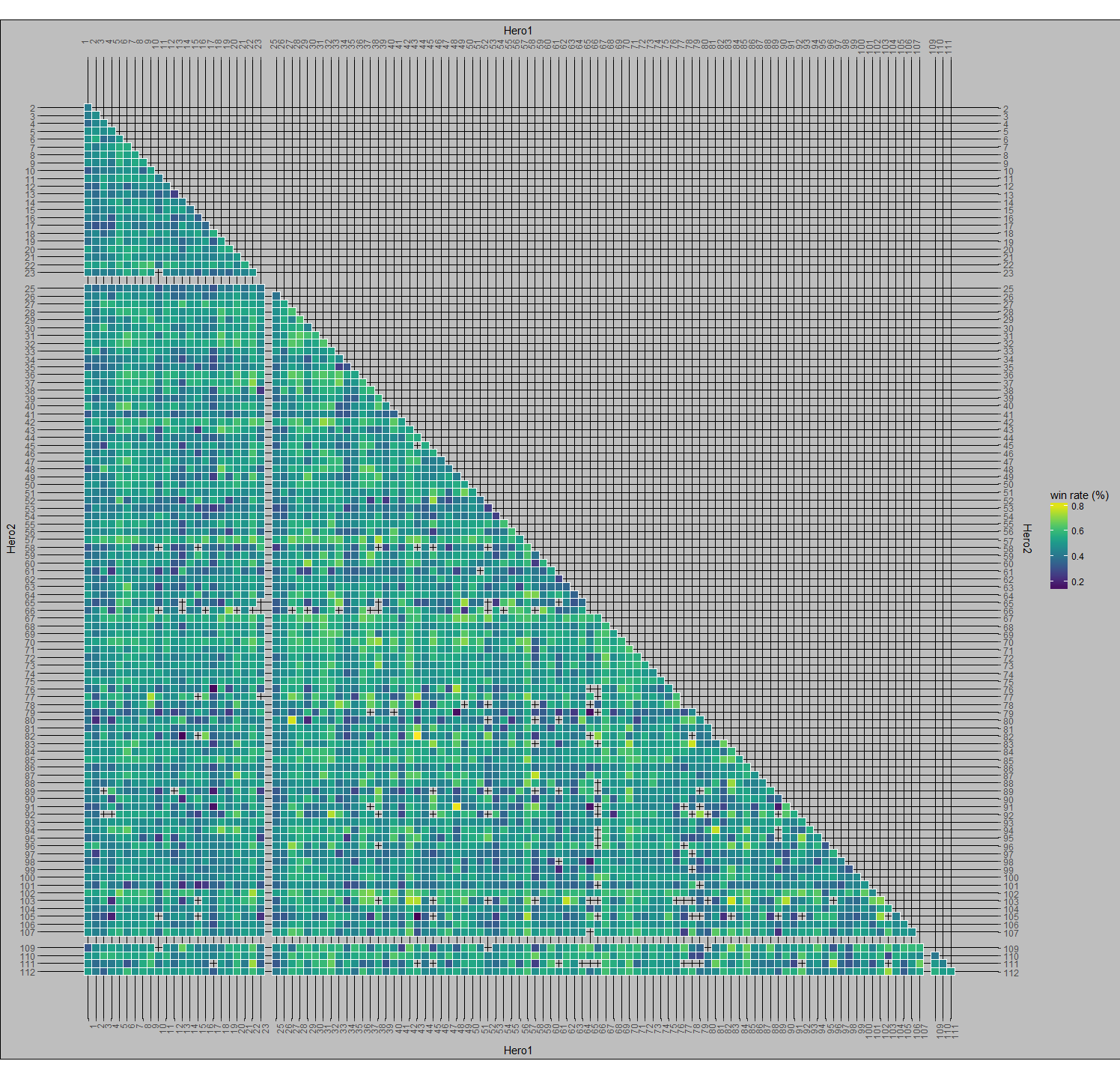
Here, in Figure 5, we chart the win rate of hero pairs. Successful pairs are more yellow and unsuccessful pairs are more blue. You’ll see some black speckles around (ex. Jakiro & Oracle, Omniknight & Elder Titan, Chen & Sandking | Warlock | Enigma). These are all heroes that were played together a single time in the data set. At the time this data was collected, there were 110 playable heroes. This means that there are 5,995 unique 2-pair combinations of those heroes (the formula for unique 2-pair permutations is n(n-1)/2). It’s pretty notable that some of these combinations weren’t picked at all, when you consider that a single game will have 20 unique hero pairs. Similar to the black spots, the bright yellow spots are of particular interest. If you remember from earlier, Chen had a very low overall pick rate and his axes for the pick per median are practically dark, but here he has 5 bright yellow spots to indicate a fantastic win rate. This is because I didn’t discriminate these tables by numbers of picks. This leads Chen has a 100% win rate with Outworld Devourer, Enchantress, Oracle, Elder Titan, and Techies although all of these pairing combined only amount to 16 co-occurrences.
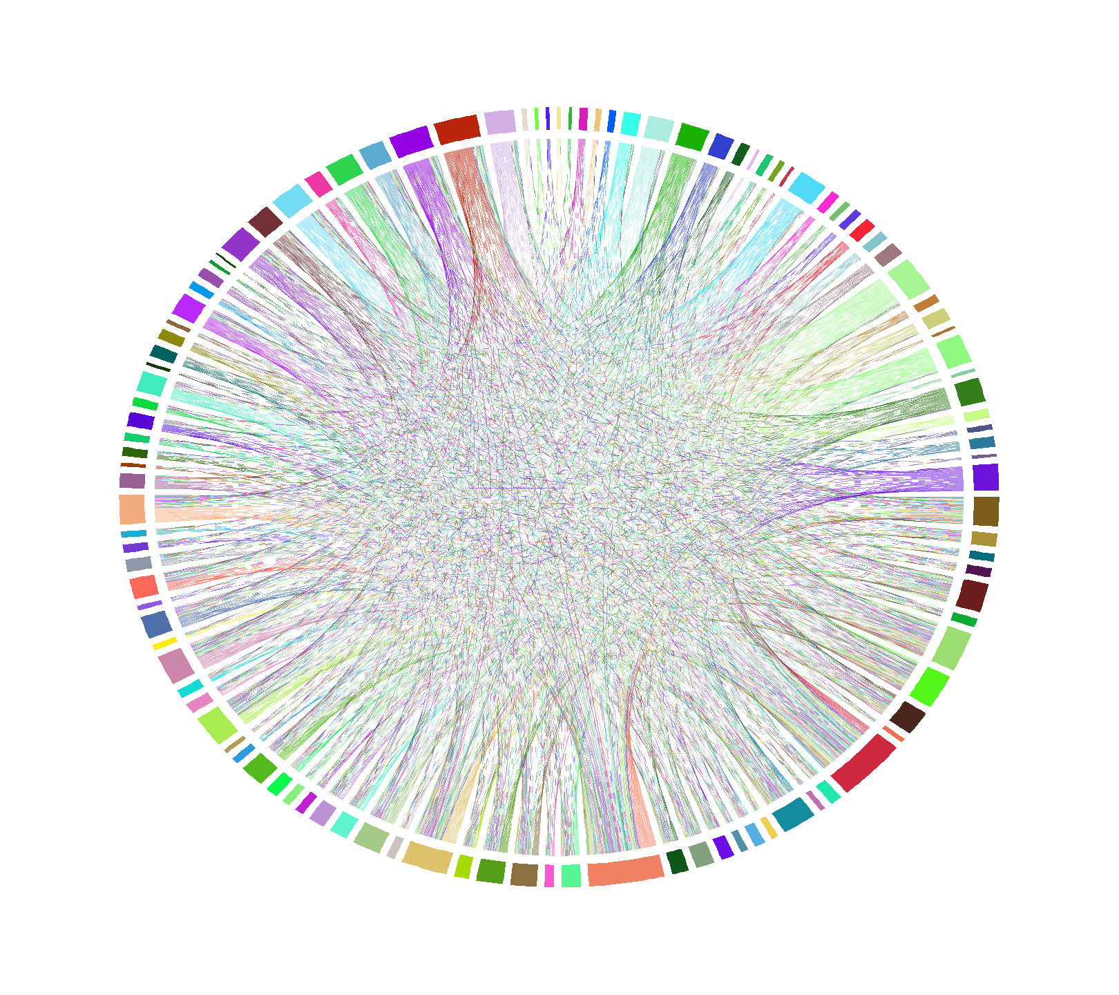
Another way to visualize hero pairs is by chord diagram. Figure 6 is an unlabeled chord diagram showing every hero pair from the data set. Now, this particular diagram isn’t useful due to the sheer number of hero pairs available, but if we start setting rules for it, patterns will start to emerge.
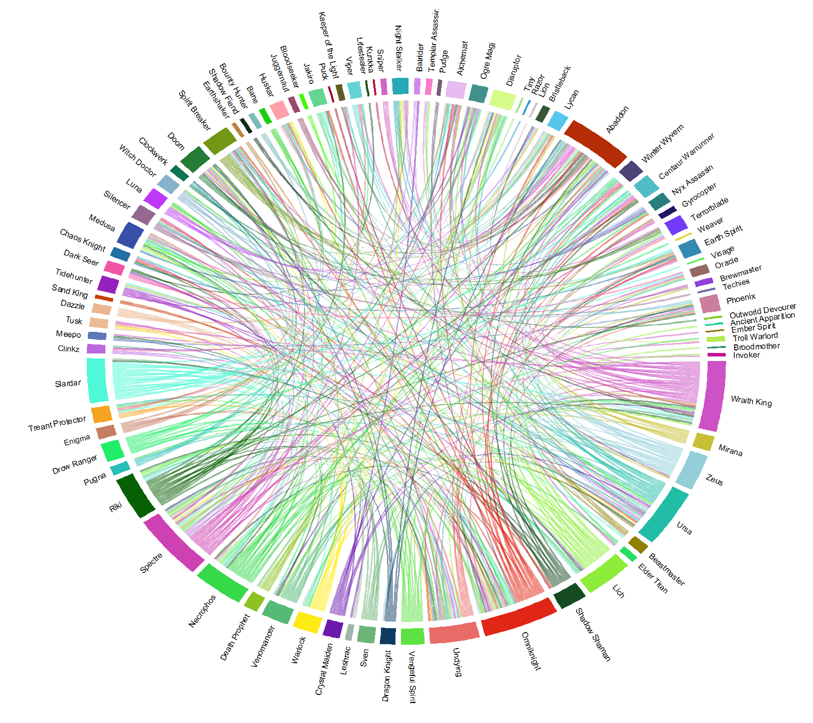
I started off by only allowing pairs that were at least as frequent as the first quartile (37 games) of overall pick frequency, and then picking pairs that had a minimum of a 60% win rate to get Figure 7. For reference, these combinations represent the top 6% winningest combinations of recorded hero pairs. This figure still mostly looks like a bowl of rainbow spaghetti, but we’re at least able to trace some of links. Additionally, the size of each hero’s arc shows us how many other heroes they pair up with at 60% win rate or higher. Omniknight, Abaddon, Wraith King, Ursa, and Spectre all have a lot of links, implying that they have more utility with successful pairs and can be fit into more team combinations than heroes with smaller slices, like Visage. An interesting thing to note here is that Shadow Fiend (near the 11 o’clock position), the second most popular hero, has a tiny sliver and has just 2 other heroes with whom he shares a 60+% win rate with. Additionally Windranger, the most popular hero, isn’t even represented in this grouping.
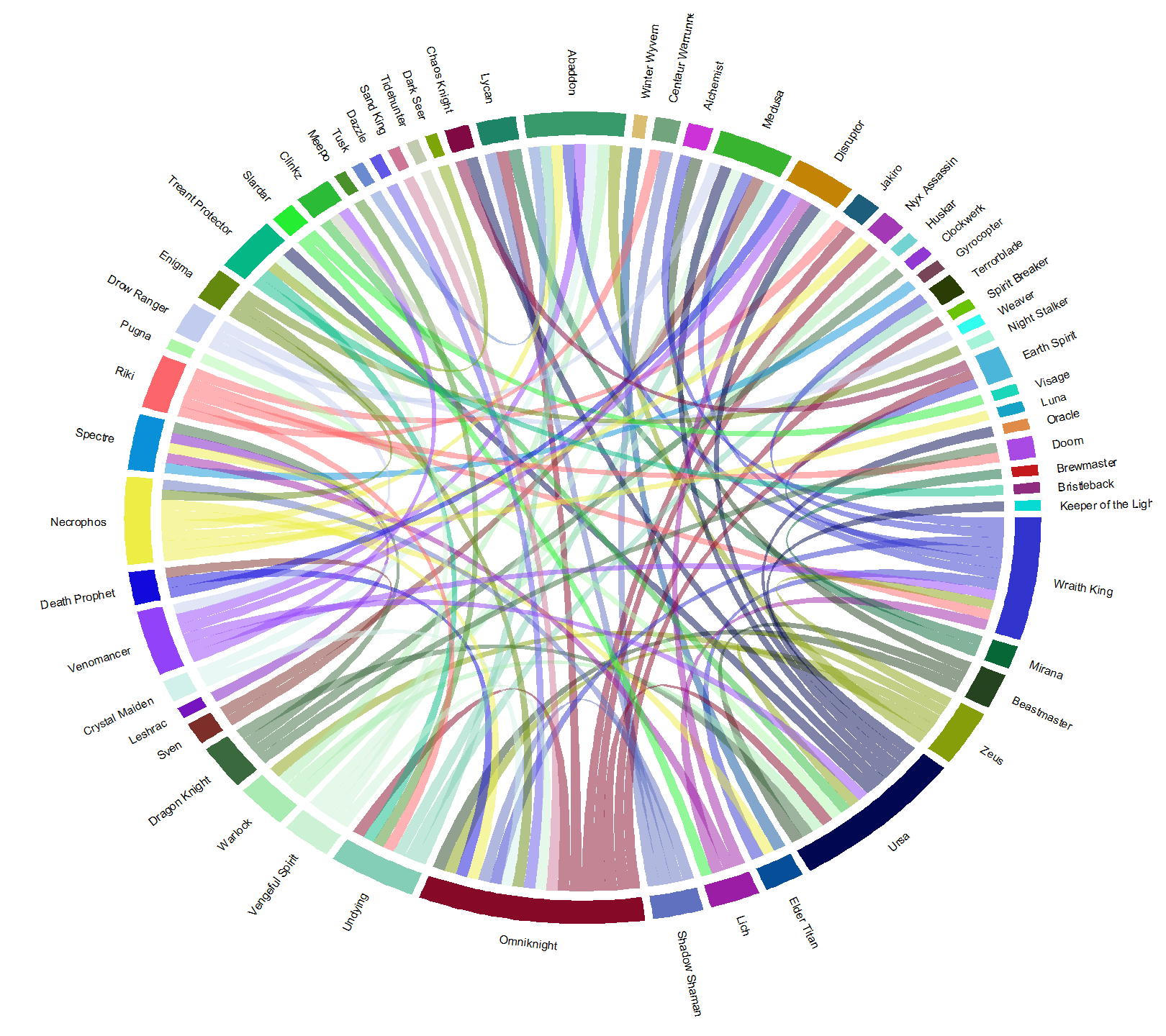
If we narrow the selection of hero pairs down even further, to win rates 65% and higher, we get Figure 8. This is top 2% winningest combinations for hero pairs. Here, the dominance of Omniknight, Ursa, and Wraith King grow while Abaddon stays about the same and Specter becomes less common. The heroes here have displayed are significantly represented in picks, and win a lot with their links. The heroes with more links win a lot with more different teams. Coincidentally, the heroes here with the biggest arc lengths are also, generally, easy to play. This makes them great choices for beginners. If you’re already knowledgeable about Dota 2 heroes, then you can use the diagram to draw conclusions about why these pairs work well together. For example, Lich is paired with Wraith King, Disruptor, Spectre, and Slardar. Lich synergizes very well with all of these heroes due to his abilities being able to slow and stun, either covering some of his partner’s weaknesses or pairing with their abilities to get more bang for your buck.
It’s important to adjust for hero success when looking for these links. If you were to go through the same method for Figure 8, but instead of looking at win rate, you look at just hero pick frequency, then you get Figure 9. Windranger and Shadow Fiend reappear, representing nearly 1/3rd of the pairs. The mean win rate of Figure 9 is pretty much a coin toss, weighing in at just 50.5%. For comparison, the mean win rate for the pairs in Figure 8 is 67.5%.
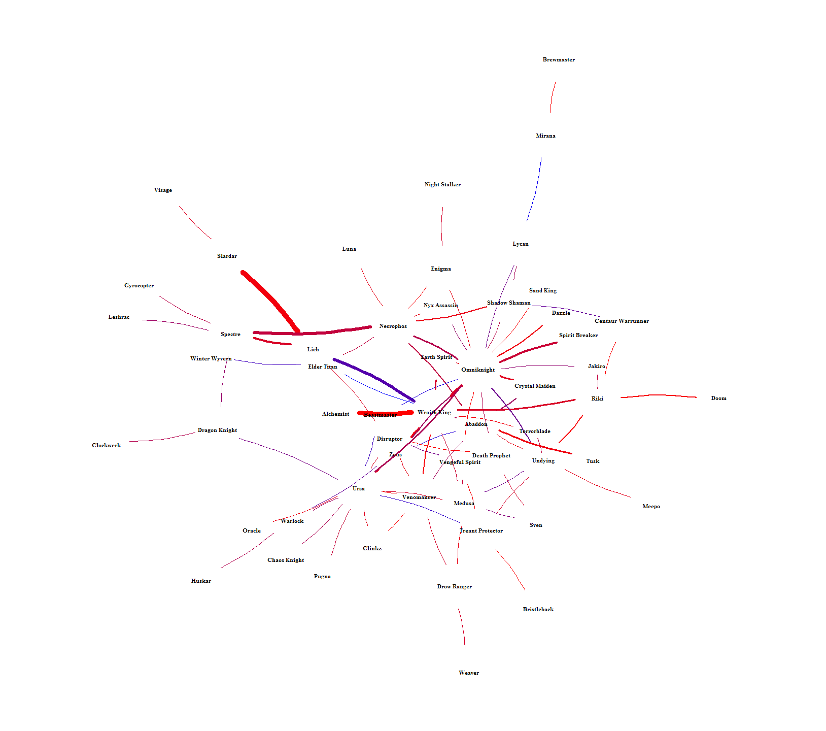
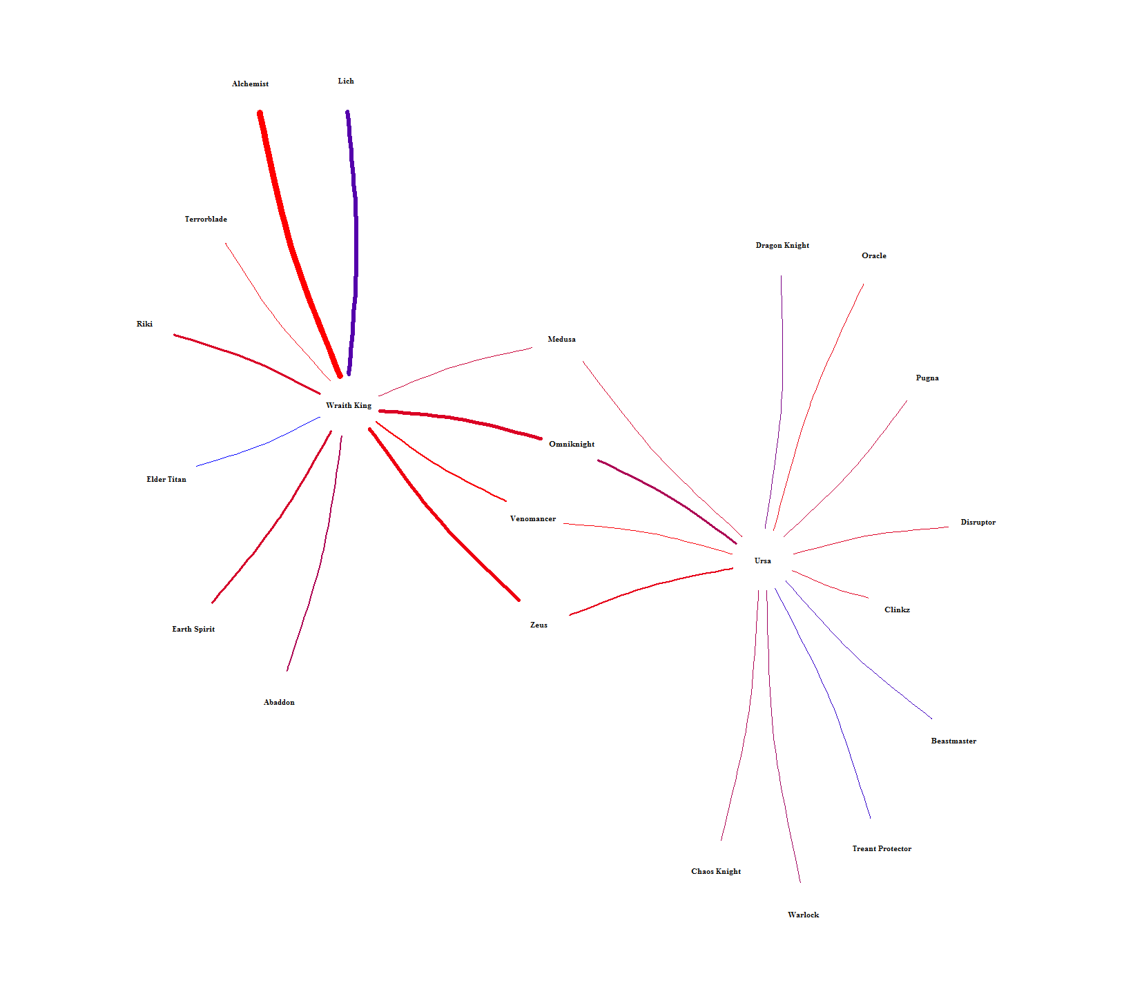
The chord graph makes it difficult to see how hero-pairs are related to each other. Figure 10 solves this by showing the intra-pairing relationships by laying out each hero into a network. The color is scaled between lower (red) and higher (blue) win rates and the width of each connection is scaled by how many times each pair was picked. Heroes can then be related to each other by seeing who they have in common or how far removed they are from everyone else. For example, Brewmaster is way out on the fringe, only connected to one person (Mirana) who is also only connected to one person (Lycan). An example of indirect similarity is Ursa and Wraith King. They don’t have any direct connection, but they share connections to each other through Medusa, Omniknight, Venomancer, and Zeus. It’s hard to see in Figure 10, so I singled them out in Figure 11. Relationships like this should mean that each indirect hero-link alludes to the heroes having similar roles.
Through this project, I’ve created a framework to explore and assess the relationships and success between heroes with visualizations. In these visualizations, I’ve explored time series analysis, part to whole and ranking analysis, correlation analysis, multivariate analysis, and a couple different types of network analysis. For future work, I’m also working with this data to try to use machine learning techniques to establish predictions for victory depending on hero pairs.
The code I used can be seen at my github.
