by Ryan | Feb 13, 2017 | visual analytics
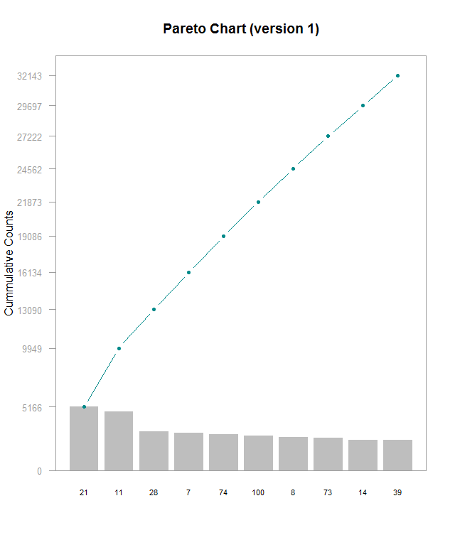
Here’s a Pareto chart (made with this guide) I made with a subset of data from this Kaggle, which I’m using for another project. I’m working on understanding lookup tables to be able to label the x axis with actual names instead of hero_ids, but that’s for another time. This chart is kind of hard to read and shows that the frequencies for these top 10 most frequently picked heroes are generally very close. In order do get the exact values for each bar, you have to do some math with the cumulative counts. I think it’d be better with cumulative percentages labeled on the right side Y- axis, regular counts on the left side, and have the chart be rescaled so that the line chart isn’t so visually dominating. Alternately making the chart wider would help a little. Furthermore, the header needs to be fixed to be relevant to the data. The RStudio guide was good starting point, but it definitely could use some refinements
by Ryan | Feb 5, 2017 | visual analytics
Here is a time-series graph I made of some data I collected from automated, neural network runs of Super Mario World. Plot.ly makes this super easy by allowing you to quickly select the axes and add new variables. Here, I will be discussing some of Stephen Few’s best practices for time-series analysis and how they apply to this graph:
- Aggregating to Various Time Intervals
I’ve chosen to display this data with the time interval being each “generation” of the neural net. Increasing the time resolution to each species and genome creates a huge amount of noise in the data, in which trends get lost. Going by each generation makes it much, much easier to see progression.
- Viewing Time Periods in Context
Including the data from the start to the finish of each level allows us to see the entire progression of each generation of the neural network. It’s easy to narrow down the time scale to make it look like there has been no progress made. Plot.ly makes this very easy zoom into smaller time periods, but also allows easy access to the full context of the graph.
- Optimizing a Graph’s Aspect Ratio
The problem here might be how I have my website set up (I’m working on a redesign), but this graph is very cramped. Viewing it on Plot.ly’s site its much more comfortable. Yoshi’s Island 4 was completed relatively quickly, but it’s hard to see on my site due to its location.
- Stacking Line Graphs to Compare Multiple Variables
I’ve combined several levels of data to see how progression and the number of generations to completion vary. Stacking the line graphs makes it much easier to read than having a set of individual graphs, though organizing it can create other readability troubles.
- Expressing Time as 0-100% to Compare Asynchronous Process
I did not utilize this in my graph but I think it would be interesting to see. Doing so could possibly uncover some level design patterns. The Super Mario games are known for being designed in a way that introduces specific level mechanics early on, generally in a safe way, then ramps up the implementation of it. I suspect that this would be evident when viewing the levels in a manner of percentage of completion.
by Ryan | Jan 20, 2017 | visual analytics
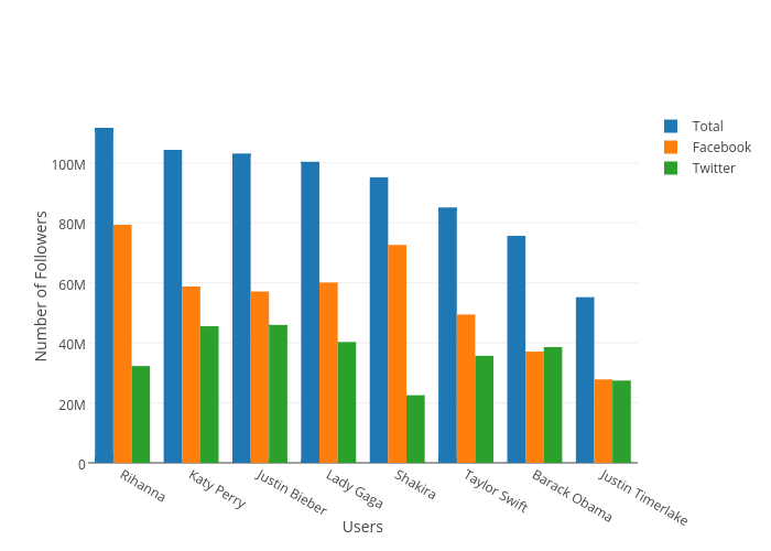
Here is my first visualization using plot.ly. I had also wanted to add a pie chart below each user’s name to show what percentage of their total followers came from Facebook and Twitter, but I’m not sure if plot.ly allows that. Importing the data was mostly easy, except I had issues with headers in xlsx files not being imported as headers. I solved this by just using a csv version of my the data.
I created the the Total variable as an aggregate of the Facebook and Twitter values in order to help give re-express the comparison between each user. The data is sorted by the highest number of Total followers, which makes it easier to read. The Y axis is scaled linearly so that the differences are clear and unambiguous. Each value is color coded which highlights each grouping and makes it easier to follow values across users. Additionally, each axis is labeled/annotated and the legend reflects the color codes of each value.
by Ryan | Jan 16, 2017 | visual analytics
I quite enjoy infographics and I often see creative visual implementations regularly. Social media outlets I follow to see visualizations are the subreddits r/dataisbeautiful, r/infographics, and r/dataisugly. Dataisugly is a great contrast to the other two and shows a ton of great (in the bad way) examples of how bad data visualization can be. I also look at hockeyviz.com regularly, which does a fantastic job at showing advanced visualizations, for example their relationships between player pairings and success. Another website that I follow is spaghettimodels.com, which shows visualizations for a huge variety of weather data. Actual applications that I have experience with are R and Excel. Others that I haven’t much of or any experience with, but I am aware of, are plot.ly, Gapminder, Tableau, and SAS.
For R, I like how “in charge” of your visualizations you are. Excel can, many times, quickly generate a plot or chart, but many times you aren’t able to make some specific changes to the visualization. Plot.ly is nice because of its accessibility, but I don’t know much about its capability. Gapminder looks great from Hans Rosling’s TED Talks, which are some of my favorite TED Talks, but I don’t know anything about it in the terms of applicability, usability, or capability.
by Ryan | Dec 2, 2016 | advanced statistics
I have a set of 359,043 tweets (object named zq) with 27 variables from 8/25 -9/5 that have the word “zika” in them. After removing any tweets that have duplicate tweet_id’s and tweets that are scraped/parsed incorrectly, I was left with 358,613 tweets. I would like to determine how different hash tags effect how often a tweet with an image gets retweeted.
From looking at the data previously, I noticed that bees were a hot topic and not something we normally think about within the context of zika. I suspect that, within the data set, using bees as a hashtag will be associated a higher amount of retweets per tweet than some other tweets. I’m going to compare #bees with #zika and #mosquito.
H0: # of retweets per tweet ( bees = zika = mosquito )
H1: # of retweets per tweet ( bees > zika | mosquito )
To start off, we need to isolate the tweets that have embedded images. I have determined that the easiest and most accurate way to identify an embedded image is to look for “photo/1” in the parsed_media_url field of the data set:
zqimage <- zq[grep("photo/1", zq$parsed_media_url),]
This leaves us with 83,266 tweets that have images embedded in them. Now, the hashtags are stuck within the “hashes” column, and are delimited by semicolons. Using tidyr, we can separate those out into more columns:
library("tidyr")
zq1 <- separate(zqimage, col = hashes, into = c("hash1", "hash2", "hash3",
 "hash4", "hash5", "hash6", "hash7", "hash8", "hash9", "hash10", "hash11",
 "hash12", "hash13", "hash14", "hash15", "hash16", "hash17", "hash18", "hash19",
 "hash20"), sep = ";", extra = "merge", fill = "right")
This adds 19 more columns, which should then either have their own hashtag, or a N/A value. From here, we can use apply to count up the frequency of each hashtag and create a table to show us what the 30 most popular hashtags are:
library("plyr")
hashes <- apply(zq1[,24:43], 2, FUN=function(x) plyr::count(x))
hashes <- do.call(rbind.data.frame, hashes)
hashes <- plyr::ddply(hashes,"x",numcolwise(sum))
hashes <- hashes[!is.na(hashes[,1]),]
hashes <- head(arrange(hashes,desc(freq)), n = 100)
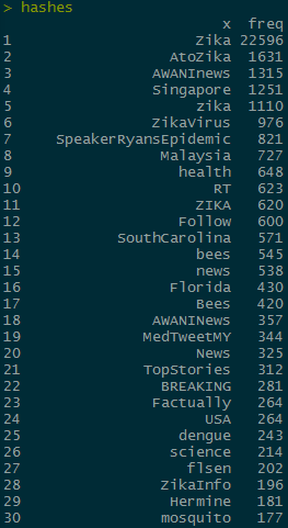
The hashtags I want to compare are “bees” and “mosquito” which are the 14th and 30th most common hashtags, respectively. In order to do further analysis, I need to subset the rows to only include the max value of retweet_count for each unique tweet. I’m going to do it to zqimage instead of the hashes object so that I can use grep on the non separated hashes column later:
library("dplyr")
zqimage <- zq[grep("photo/1", zq$parsed_media_url),]
zqimage <- zqimage %>% group_by(text) %>% filter(retweet_count == max(retweet_count),
 favorite_count == max(favorite_count))
zqimage <- arrange(zqimage, desc(retweet_count))
I want to compare the contributions between hash tags, so I can get rid of any rows that don’t have any hashtags
zqimage <- zqimage[!is.na(zqimage$hashes), ]
This leaves us with 9,651 unique tweets that have hashtags and have embedded images. In order to conduct an ANOVA test we need to categorize the tweets. In order to do so, we need to create a new column that says if the tweets have “bees”, “mosquito”, or “zika” in them
zqimage$hashhash <- ifelse(grepl("bees", zqimage$hashes, ignore.case = TRUE), "bees",
 ifelse(grepl("mosquito", zqimage$hashes, ignore.case = TRUE), "mosquito",
 ifelse(grepl("zika", zqimage$hashes, ignore.case = TRUE), "zika", "Other")))
From here, we can apply the ANOVA test
fit <- aov(zqimage$retweet_count ~ hashhash, data = zqimage)
Making a boxplot of the data shows something very telling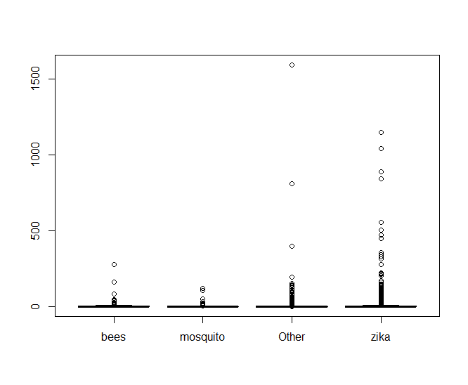
It looks like there’s an oppressive amount of tweets with abnormally high values of retweets that are making it hard to see what’s going on, so lets look at a log scale of only the tweets that have been retweeted.
zqn0 <- zqimage[!zqimage$retweet_count == 0,]
boxplot(log(zqn0$retweet_count) ~ zqn0$hashhash
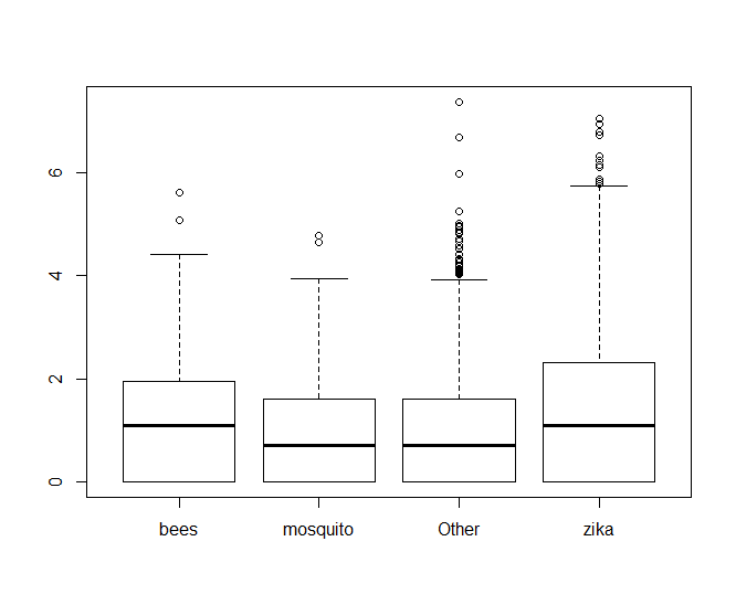
From there, we can see clearly that hashtags with bees performs better than mosquito, but it looks almost neck-and-neck with zika. If we look at the values of fit$coefficients, we can see that bees edges out zika in performance too.
> fit$coefficients
 (Intercept) hashhashmosquito hashhashOther hashhashzika
  7.1780822        -4.9327290    -4.8003600   -0.9336632
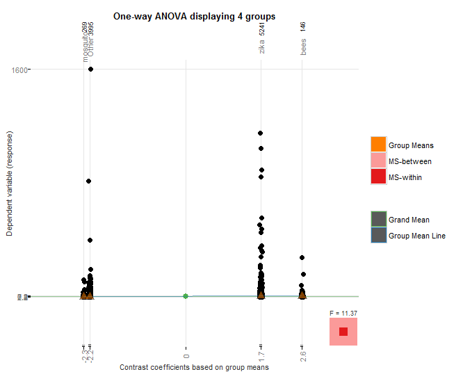
I used the granovagg package to create the above graphic which again shows that bees outperforms mosquito, even though mosquito had nearly an order of magnitude fewer hashtags than case-insensitive “bees”, and it also outperforms case-insensitive “zika” despite the fact that zika hashtags had over 22,000 more hashtags.
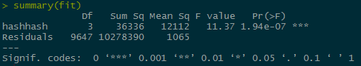
The p value for the hashes is very small, causing us to fail to reject the null hypothesis and accept the alternate hypothesis that the bees hashtags perform better than the mosquito or zika hash tags.